Card report for apps
The card report feature is a visual presentation of key analytics metrics and KPIs, providing a clear snapshot of performance and trends at a glance, using essential data and comparison calculations. Configurable for specific reporting needs, each card type provides valuable insights, streamlining the developer’s workflow within apps.
While card reports enhance efficiency in displaying data, conventional card components in page builder will still enable you to visualize data for use cases like number of tasks assigned and tasks overdue.
Creating a card report in apps
To create a card report in apps,
Sign in to Kissflow.
Click + Create in the left navigation menu > Apps. Alternatively, click the Explore option in the left navigation and click Create on the top right corner to open the Create from scratch menu.
You'll be redirected to the App development environment in a new browser tab.
Open a process, board or a dataform.
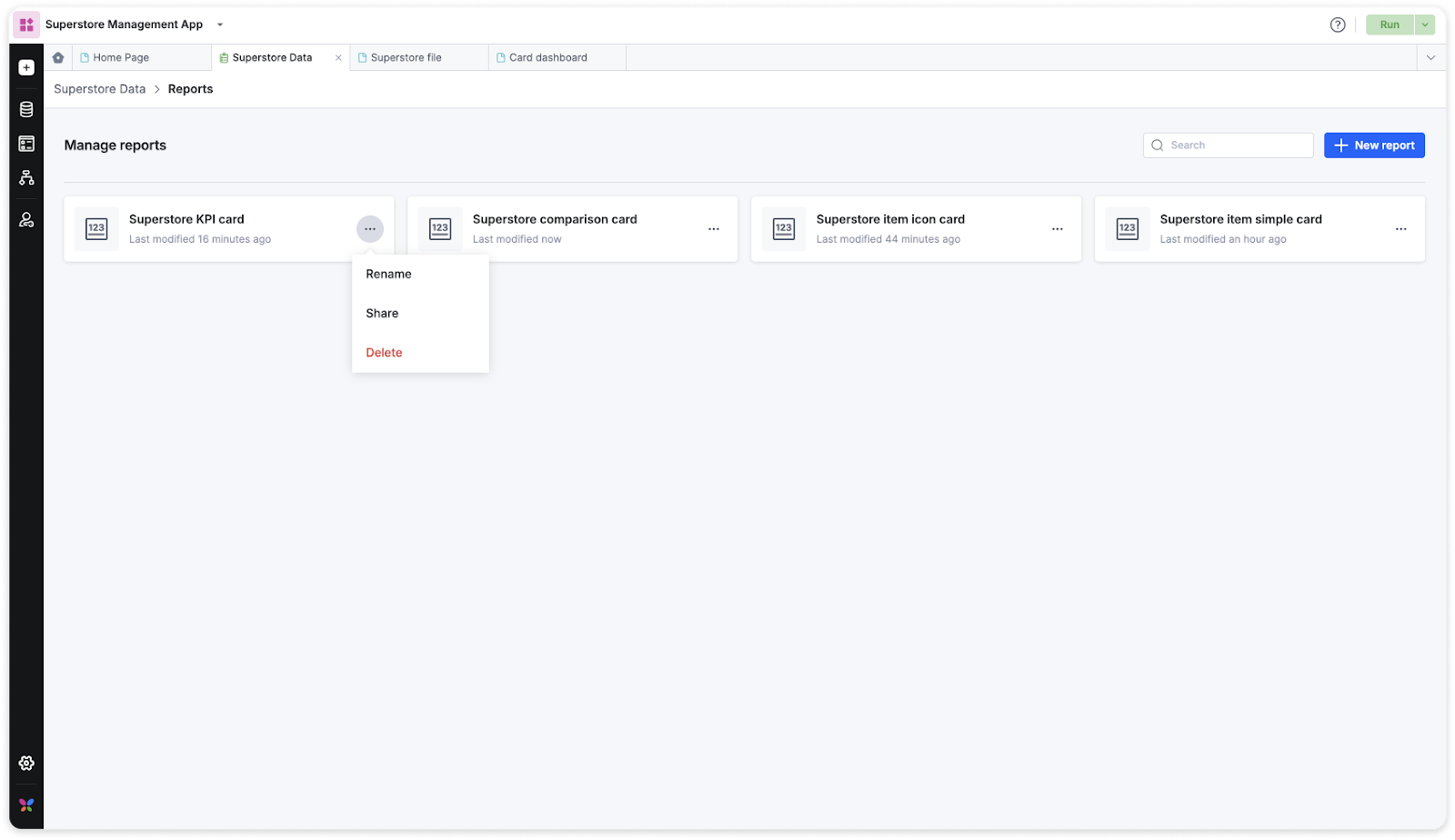
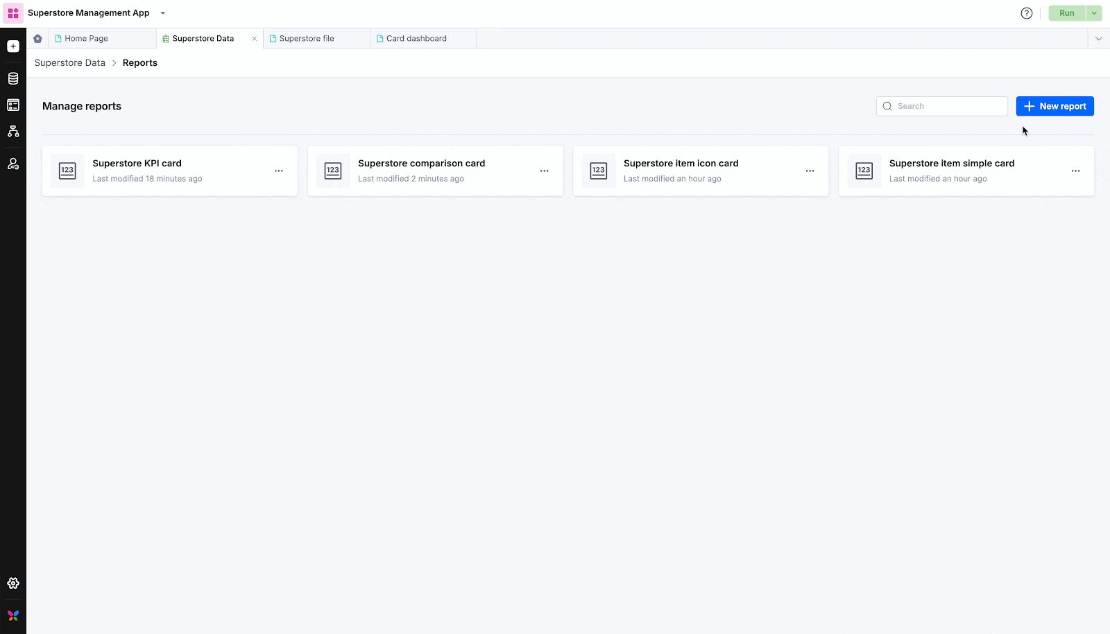
Navigate to the Reports section in your process, board, or dataforms.
Under Manage reports, click New report.
Provide a name for your report.
Choose Card as the report type.
Note:
Card report feature is not available in analytics.
Card types
There are four types of card reports.
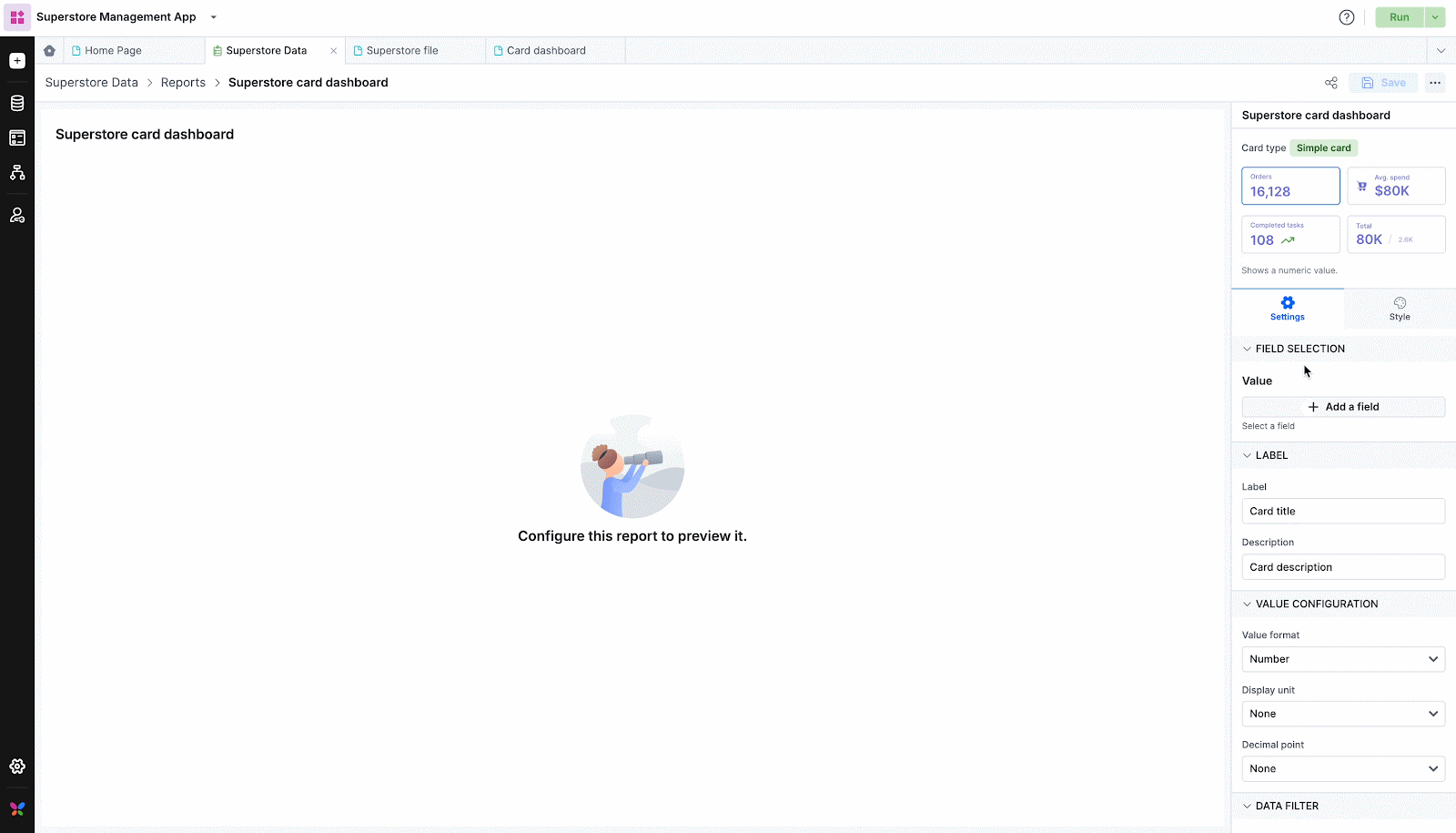
Simple card
Icon card
KPI card
Comparison card
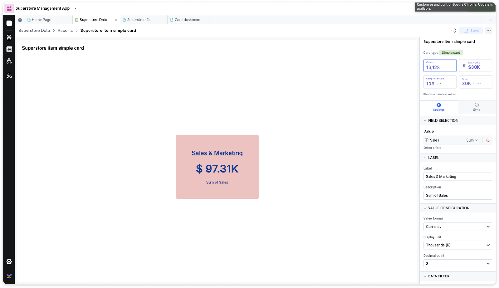
Simple card
A simple card displays a single metric prominently. It provides a clear and concise representation of a specific numeric value.
Settings
Selecting fields
Choose the field you want to display in the card. You can only select one field.
Labeling cards
Label: Set a title for the card.
Description: Provide a short description for additional context.
Value configuration
Value format: Choose from Number, Currency, Percentage, and Custom. When you select Custom, you can add the prefix and suffix to the displayed value.
Display unit: Specify the unit (None, Thousands, Millions, Billions).
Decimal point: Set the number of decimal points.
Data filter
Add filters to your cards as needed.
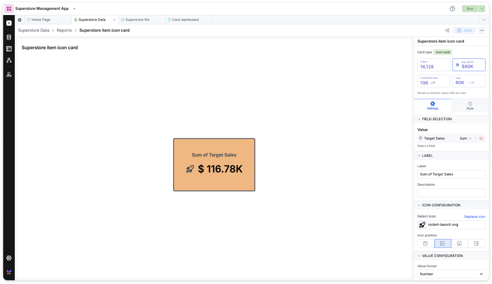
Icon card
The icon card combines a numeric value with an associated icon. It adds a visual element to the metric, which makes it easier to interpret and recall the information.
Settings
Selecting fields
Choose the field you want to display in the card. You can only select one field.
Labeling cards
Label: Set a title for the card.
Description: Provide a short description for additional context.
Icon configuration
Select icon: Select an icon from the set of icons given in the icon library. Click Replace icon to change the icon.
Icon position: You can change the position of your icons in the card.
Value configuration
Value format: Choose from Number, Currency, Percentage, and Custom. When you select custom, you can add the prefix and suffix to the displayed value.
Display unit: Specify the unit (None, Thousands, Millions, Billions).
Decimal point: Set the number of decimal points.
Data filter
Add data filters as per your requirements for the cards.
KPI card
The KPI card displays key performance indicators, offering insights into the progress towards measurable goals. It includes actual and target values, as well as a calculated KPI value.
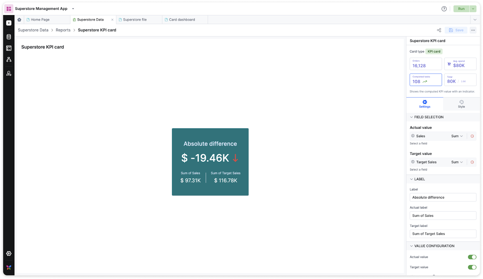
It allows for a comprehensive view of performance with the help of four different key performance indicators namely, absolute difference, percentage of actual value, percentage of absolute difference and percentage of difference to average.
Understanding KPI metrics with KPI card
Let us understand these KPI metrics with a use case. Take the customer relationship management (CRM) cycle of an organization where their sales team have set ambitious targets to achieve in terms of revenue generation and customer acquisition.
The team has aimed to achieve $1,000K in monthly sales revenue. However, they have recorded $950,000 in actual sales revenue for the month. This is clearly a ‘High is good’ trend direction.
KPI value types |
Formula |
Description |
Example |
Absolute difference |
Actual value - Target value |
Calculates the absolute difference between actual value and the target value. |
Absolute difference: |$950,000 - $1,000,000| = $50,000 The absolute difference between the actual value and the target value indicates how far off the outcome is from the desired value. Here the absolute difference is $50,000 between the actual and targeted sales revenue. |
% of actual value |
(Actual value / Target value) x 100 |
Calculates the percentage of actual value to target value. |
% of Actual value: ($950,000 / $1,000,000) * 100 = 95% The actual sales revenue accounts for 95% of the targeted revenue. This percentage indicates how close the sales team has come to achieving the set revenue target.
|
% of absolute difference |
(Absolute difference / Target value) x 100 |
Calculates the percentage of absolute difference to target value. |
% of Absolute difference: ($50,000 / $1,000,000) * 100 = 5% We see that the absolute difference of $50,000 constitutes 5% of the targeted sales revenue. This metric underscores the magnitude of the deviation from the desired revenue goal. |
% of difference to average |
(Absolute difference/((Actual value + Target value)/2)) x 100 |
Calculates the percentage of absolute difference to the average of actual and target value.. |
% of Difference to average : ($50,000 / $975,000) * 100 ≈ 5.13% |
These KPI metrics offer valuable insights into the company's sales performance, facilitating informed decision-making and strategic adjustments.
Settings of KPI card
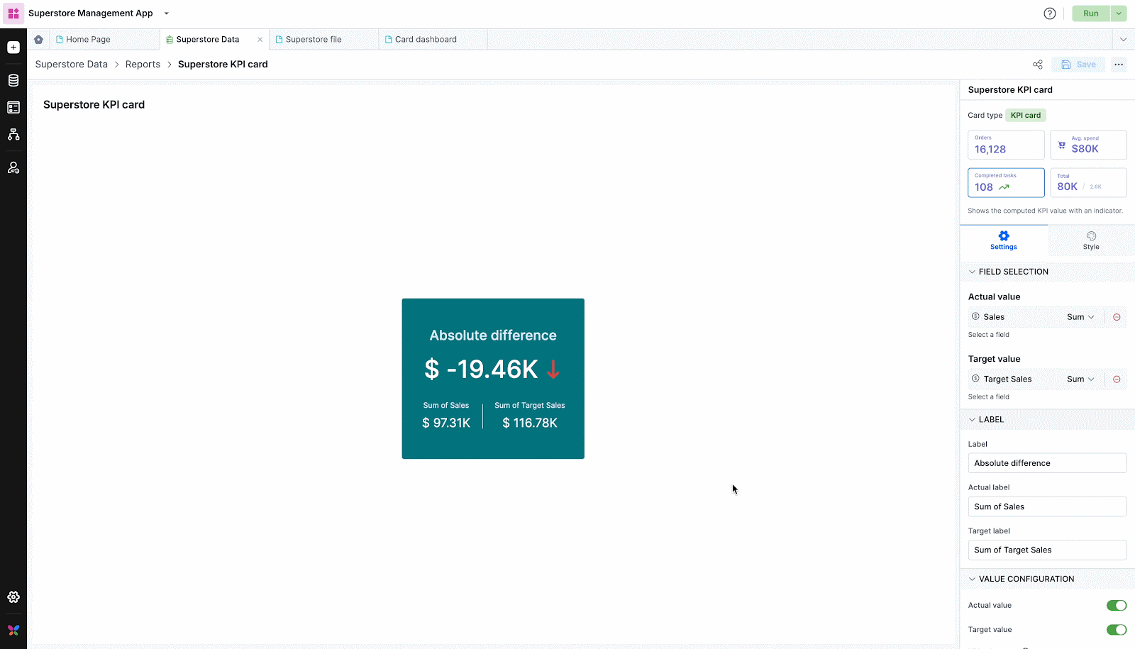
Selecting fields
Choose the fields you want to display in the card. Select one field for actual value and target value.
Labeling cards
Label: Set a title for the card.
Actual label: Provide a title for the actual label.
Target label: Provide a title for the target label.
Value configuration
Actual value and target value: Toggle buttons to enable/disable these values.
KPI value type: Choose from different KPI value types such as absolute difference, percentage of target, percentage of change, percentage of difference.
Value format: Configure formatting options for Number, Currency, Percentage, and Custom. When you select custom, you can add the prefix and suffix to the displayed value.
Display unit: Specify the unit (None, Thousands, Millions, Billions).
Decimal point: Set the number of decimal points.
Note:
You can add units only to actual value, target value and absolute difference using value format.
Trend configuration
Trend direction: Customize trend directions based on the specific use case and the nature of your results whether ‘High is good’ or ‘Low is good’.
Trend position: You can place the position of the trend icon on the left or right of the value.
Trend high: Select icons to denote the trend as high. Click Replace icon to change the icon.
Trend medium: Select icons to denote the trend as medium. Click Replace icon to change the icon.
Trend low: Select icons to denote the trend as low. Click Replace icon to change the icon.
Data filter
Add data filters to your report as needed.
Comparison card
The comparison card allows you to view and compare two metrics side by side. It provides a quick visual representation of how well actual values align with the set target values.
Settings
Selecting fields
Choose the fields you want to display in the card. Select one field for the actual value and target value.
Labeling cards
Actual label: Provide a title for the actual label.
Target label: Provide a title for the target label.
Value configuration
Value format: Configure formatting options for Number, Currency, Percentage, and Custom. When you select custom, you can add the prefix and suffix to the displayed value.
Display unit: Specify the unit (None, Thousands, Millions, Billions).
Decimal point: Set the number of decimal points.
Data filter
- Add data filters to your report as needed to view specific data.
Note:
The following fields will be reflected under the Field selection dropdown in card report - Text, Number, Currency, Date(parts), DateTime(parts), Email, Yes/No, Rating, Dropdown, Slider, User, Aggregation, Sequence number.
Applying styles to card reports
Style your cards based on its alignment, background, values, actual values, target values, labels, actual labels, target labels, description, icons, and trend icons.
Style options |
Simple card |
Icon card |
KPI card |
Comparison card |
Alignment |
||||
Horizontal alignment |
✅ |
✅ |
✅ |
✅ |
Vertical alignment |
✅ |
✅ |
✅ |
✅ |
Horizontal gap |
❌ |
❌ |
✅ |
✅ |
Vertical gap |
✅ |
✅ |
✅ |
❌ |
Background |
||||
Background color |
✅ |
✅ |
✅ |
✅ |
Padding |
✅ |
✅ |
✅ |
✅ |
Value |
||||
Font color |
✅ |
✅ |
✅ |
❌ |
Font size |
✅ |
✅ |
✅ |
❌ |
Font weight |
✅ |
✅ |
✅ |
❌ |
Padding |
✅ |
✅ |
✅ |
❌ |
Font style |
✅ |
✅ |
✅ |
❌ |
Actual value and target value |
||||
Font color |
❌ |
❌ |
✅ |
✅ |
Font size |
❌ |
❌ |
✅ |
✅ |
Font weight |
❌ |
❌ |
✅ |
✅ |
Font style |
❌ |
❌ |
✅ |
✅ |
Padding |
❌ |
❌ |
✅ |
✅ |
Label |
||||
Font color |
✅ |
✅ |
✅ |
❌ |
Font size |
✅ |
✅ |
✅ |
❌ |
Font weight |
✅ |
✅ |
✅ |
❌ |
Font style |
✅ |
✅ |
✅ |
❌ |
Padding |
✅ |
✅ |
✅ |
❌ |
Actual label and target label |
||||
Font color |
❌ |
❌ |
✅ |
✅ |
Font size |
❌ |
❌ |
✅ |
✅ |
Font weight |
❌ |
❌ |
✅ |
✅ |
Font style |
❌ |
❌ |
✅ |
✅ |
Padding |
❌ |
❌ |
✅ |
✅ |
Description |
||||
Font color |
✅ |
✅ |
❌ |
❌ |
Font size |
✅ |
✅ |
❌ |
❌ |
Font weight |
✅ |
✅ |
❌ |
❌ |
Padding |
✅ |
✅ |
❌ |
❌ |
Font style |
✅ |
✅ |
❌ |
❌ |
Icon |
||||
Icon color |
❌ |
✅ |
❌ |
❌ |
Icon size |
❌ |
✅ |
❌ |
❌ |
Padding |
❌ |
✅ |
❌ |
❌ |
Border width |
❌ |
✅ |
❌ |
❌ |
Border color |
❌ |
✅ |
❌ |
❌ |
Border radius |
❌ |
✅ |
❌ |
❌ |
Border style |
❌ |
✅ |
❌ |
❌ |
Trend icon |
||||
Trend high icon color |
❌ |
❌ |
✅ |
❌ |
Trend medium icon color |
❌ |
❌ |
✅ |
❌ |
Trend low icon color |
❌ |
❌ |
✅ |
❌ |
Icon size |
❌ |
❌ |
✅ |
❌ |
Padding |
❌ |
❌ |
✅ |
❌ |
Other actions
Once you have configured and saved your report, you can rename, share and delete a report. To do so, click the More options button of the card report you want > select one of the required buttons > Rename, Share, Delete.