1
Card
Introduction
A card can be configured to display important data like, the available assets available, cost of available assets, or pending requests with the admin staff. It can be used to keep track of tasks or can serve a different use case such as listing out the details of a particular domain.

How to use it?
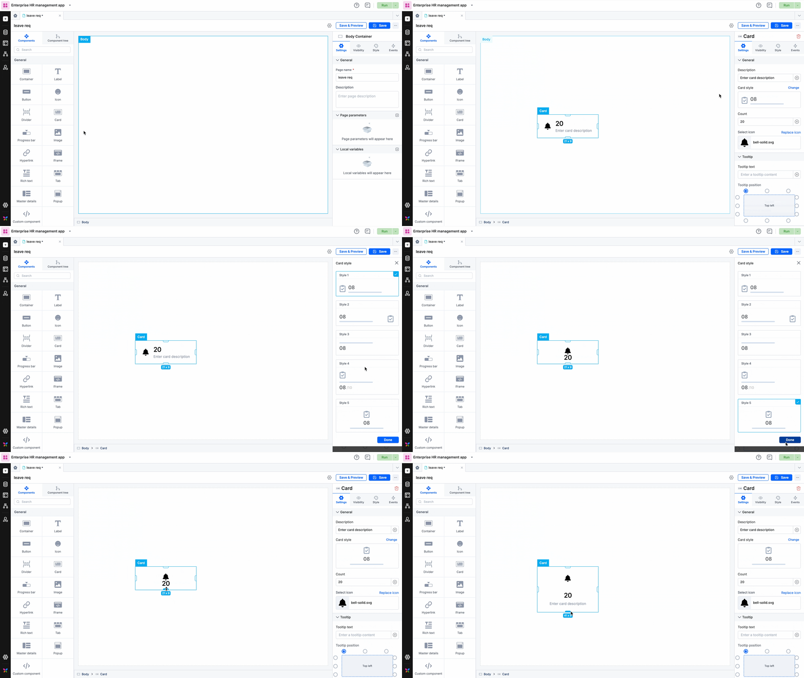
Once you drag and drop the card component, you will be able to perform the following actions:
- Enter any caption such as Tasks assigned, Tasks overdue, etc in the caption.
- Choose a card style from the different card styles that are available.
- You can enter the number of tasks as well as set the icon for the card.
- Modify the color, caption color, background color, and icon background.
- Under Style properties, you will be able to align the card, adjust the sizing, modify the padding and margin, and set the border size, color, and radius.
- In Event properties, you will be able to add the event “On click” to direct the card to perform an action.
There are three actions that can be performed:
- Redirection - This action redirects you to the user-defined pages, the system-defined home page, or lets you go back to the same page.
- Open popup - The open popup action lets you open a popup that you had created using the Popup component.
- JavaScript action - The JavaScript action lets you define the action that you want to perform using JS code, on clicking the card.
Content aside
Related Articles
