Working with custom components in Kissflow Apps
What are custom components?
Custom components play a crucial role in low-code development by enabling code reuse and accelerating app creation. Kissflow provides a variety of default page components and several default form fields, which are categorized into Basic Fields, File & Media, Data Lookup, Widget, and Advanced Fields—with the Advanced category featuring options like Signature, Geolocation, and Scanner.
In addition to these default components and fields, you can create custom components to use within your pages and forms. These reusable components allow developers to build high-quality app elements that can be shared across an app, streamlining development and improving efficiency.
Types of custom components in Kissflow Apps:
- Page components – Used to build reusable UI elements within a page. You can create page components using AI or build from scratch using the Kissflow SDK.
- Field components – Custom form fields that can be used across multiple forms.
Follow the above links for specific steps on how to create and use custom page and form field components.
Managing custom components
The Manage components page lets you view and manage all your custom components. This is where you upload your fully built custom components. To access it, click Interface in the left navigation panel, then select Components.
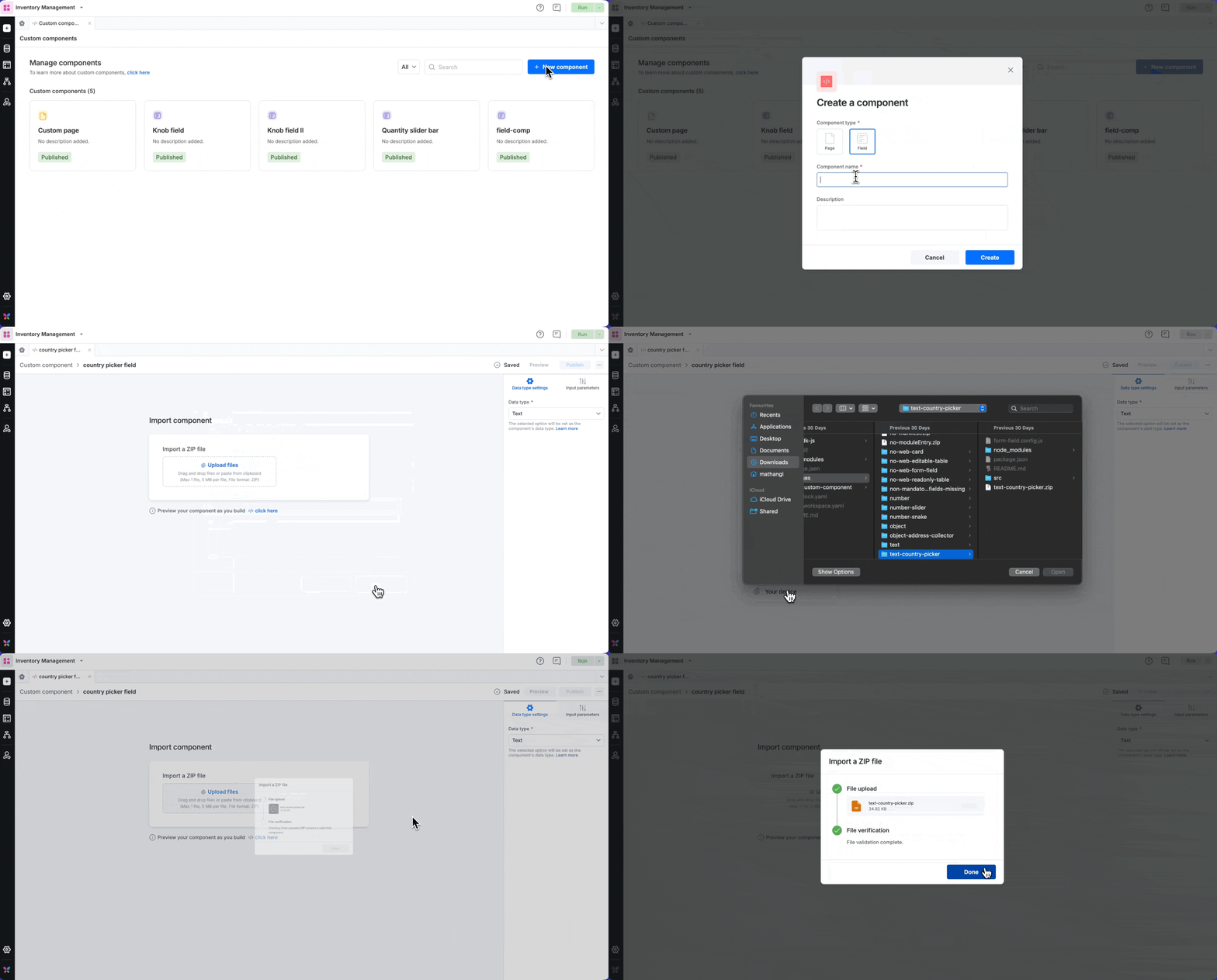
Click the New component button.
Choose the type of custom component: Page or Field. Enter a name and description and click Create.

When you are ready to upload your custom component, click the name, and it will take you to the Import component page. Importing a page component | field component.
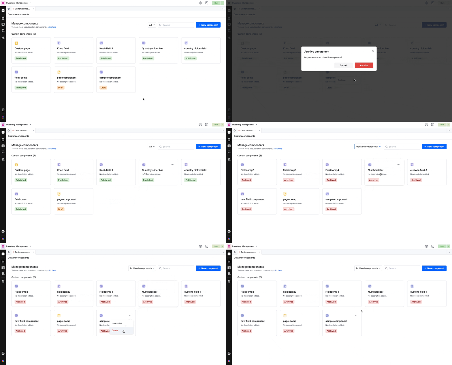
On the Manage components page, you can see the total number of custom components you've uploaded, along with their type and current status. Any user with access to the app where these components are uploaded can view and use them in pages and forms.
Notes:
- Every custom component you upload must have a unique name. i.e., it is not possible to reuse the name of a component that is archived. If you wish to update an existing custom component file, you can replace it instead.
- You can upload and publish any number of page and field components within an app.
Custom component status
Each custom component falls into one of three statuses:
Draft – A work-in-progress component that hasn’t been published yet.
Published – A component that is live and ready to be used in pages and forms.
Archived – A component that is no longer in active use but can be restored if needed.
Sorting custom components
The sort option in the Manage Components page allows you to filter components by type and status. The sort option lets you quickly view page components, field components, and archived components separately.

Note: A custom component must be published before it can be used in a form or page.
Archiving and deleting custom components
If you no longer need a custom component, you can archive or delete it:
Click the More actions menu on the desired component.
Select Archive to move it to the archived components section or click Delete to remove it permanently from your app.
Once archived, you can either unarchive or delete the component:
Unarchiving restores the component to the All section without changing its previous status. If it was published before being archived, it will remain published upon unarchiving. Likewise, a draft component will remain in draft mode.
Deleting a component permanently removes it from the system. Once deleted, it cannot be recovered.

Uploading a custom component
Navigate to the Manage components page and click the name of the custom component to which you wish to upload the build file.
You will be redirected to the Import component page. Here, you can upload your custom form field as a .zip file.
To replace an already uploaded .zip file with an updated one, click the custom component name to open it and click Replace file. Once you upload the replacement file, you must publish the component for it to take effect.

