0
Icon
Introduction
Icons are interactive elements that are used in applications for UI purposes. An icon component allows you to add icons to your page.
How to use it?
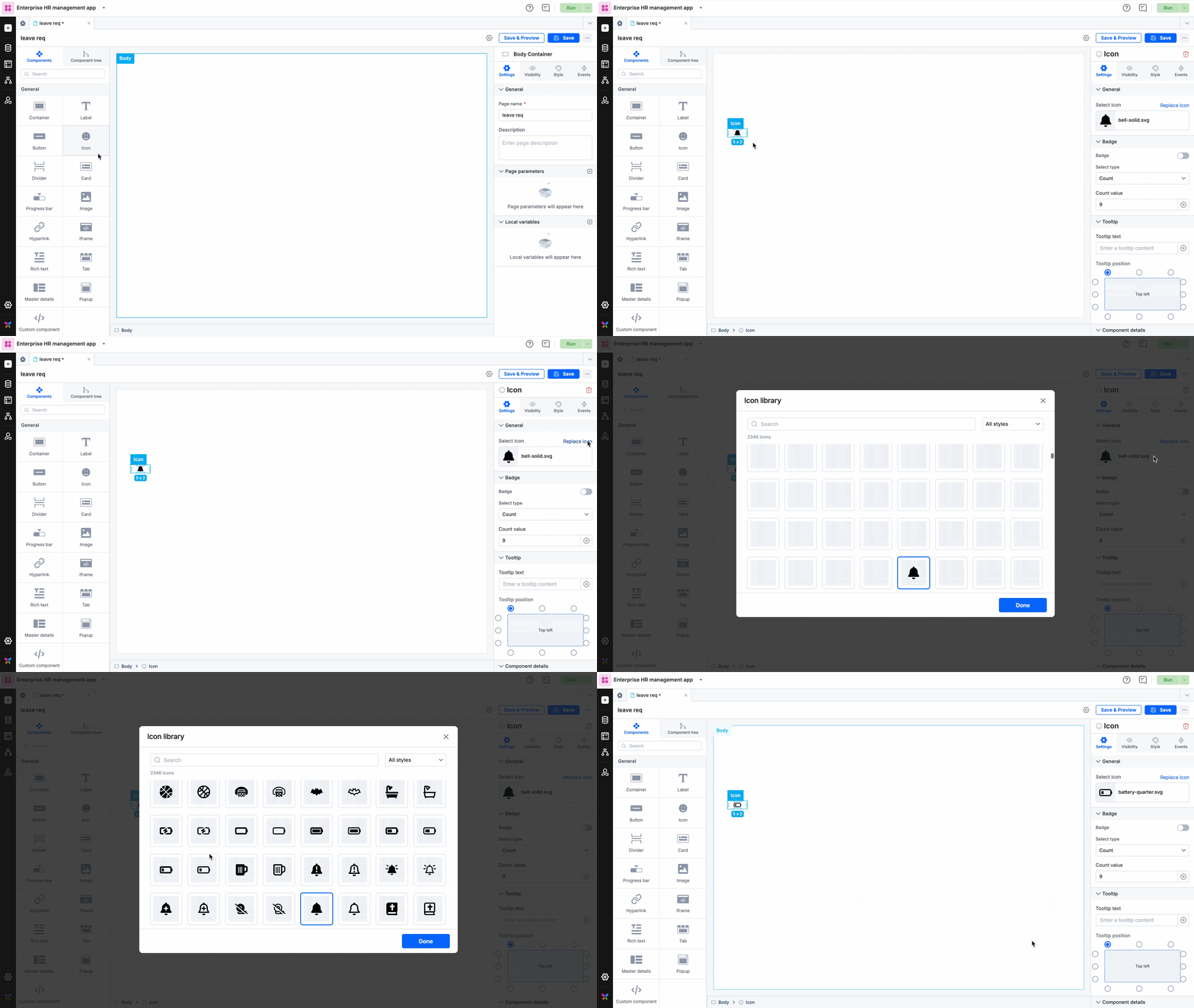
- After you drag and drop the icon component, you will find a static icon in place. This can be modified by providing a different icon URL to set an icon of your choice.

- You can choose a background color for the icon from the color palette.
- To add a badge to the icon, turn on the badge toggle button. Badges can be set as a count or as a dot.
- If a badge is set as a count, the count value can be manually set or called using global/local variables and input parameters.
- You can set the badge color from the color palette.
- You can also add a tooltip for your icon and position it.
- In Style properties, you will be able to adjust the sizing, modify the padding and margin, and set the border size, color, and radius. Learn how icon sizing works in the grid layout.
- In Event properties, you will be able to add the event “On click” to direct the icon to perform an action.
There are three actions that can be performed:
- Redirection - This action redirects you to the user-defined pages, the system-defined home page, or lets you go back to the same page.
- Open popup - The open popup action lets you open a popup that you had created using the Popup component.
- JavaScript action - The JavaScript action lets you define the action that you want to perform using JS code.
Content aside
Related Articles
