Charts in boards
You can generate reports as charts. There are ten types of charts you can choose from: auto, area stacked, area, horizontal bars, vertical bars, combo, doughnut, line, pie, and bubble.
Creating a chart
To create a chart, click the Reports button at the top right.
Click + Create report.
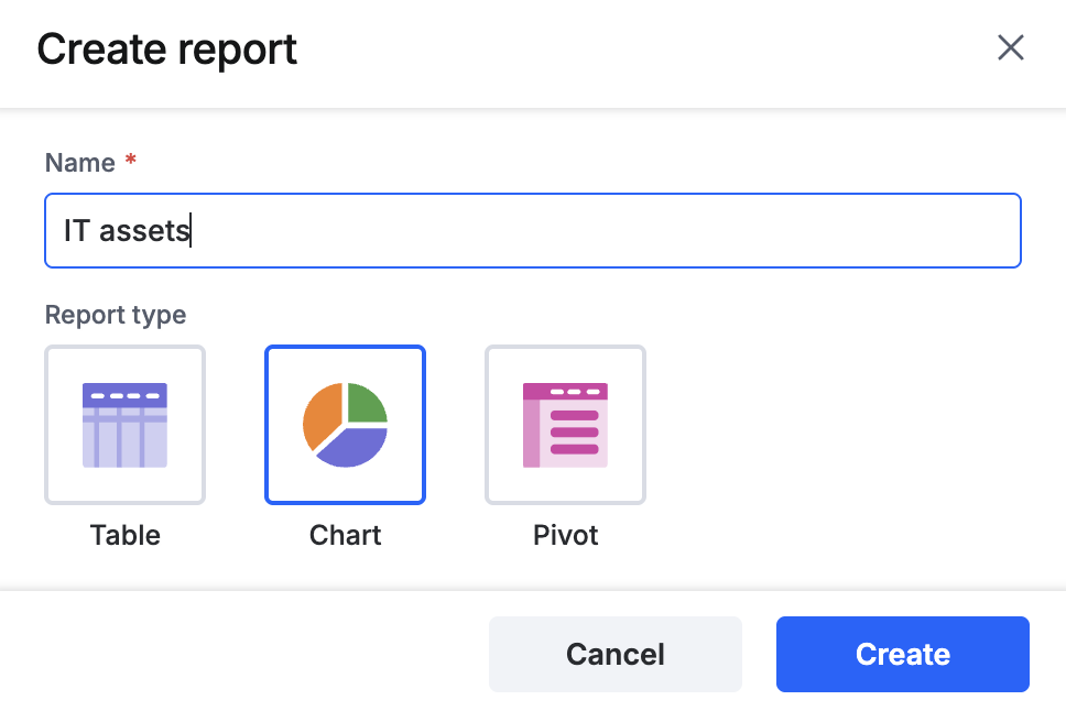
Provide a name for the chart, select Chart as the report type, and click Create.

- Choose the type of chart you want to create. Select Auto when you’re unsure what type of chart to choose, and Kissflow will create the best one for you.
Types of charts
- Area charts function similar to a line chart, but with the areas below the lines filled in. You can use this chart to show how values develop over time.
- Area stacked chart is an area chart that includes a stack of multiple areas. It can be used instead of a line graph with multiple graphs to compare development or trend over time.

- Horizontal bar charts avoid clutter when one data point is longer than the others or if you have more than ten items to compare. You can use bar charts to display negative numbers.

- Vertical bar charts are used to show a comparison among different items, or they can show a comparison of items over time.
- Line charts use lines to represent changes to data over a period of time. The y-axis displays the value and the x-axis displays the variable.
- Combo charts are a combination of charts, like bar and line charts.
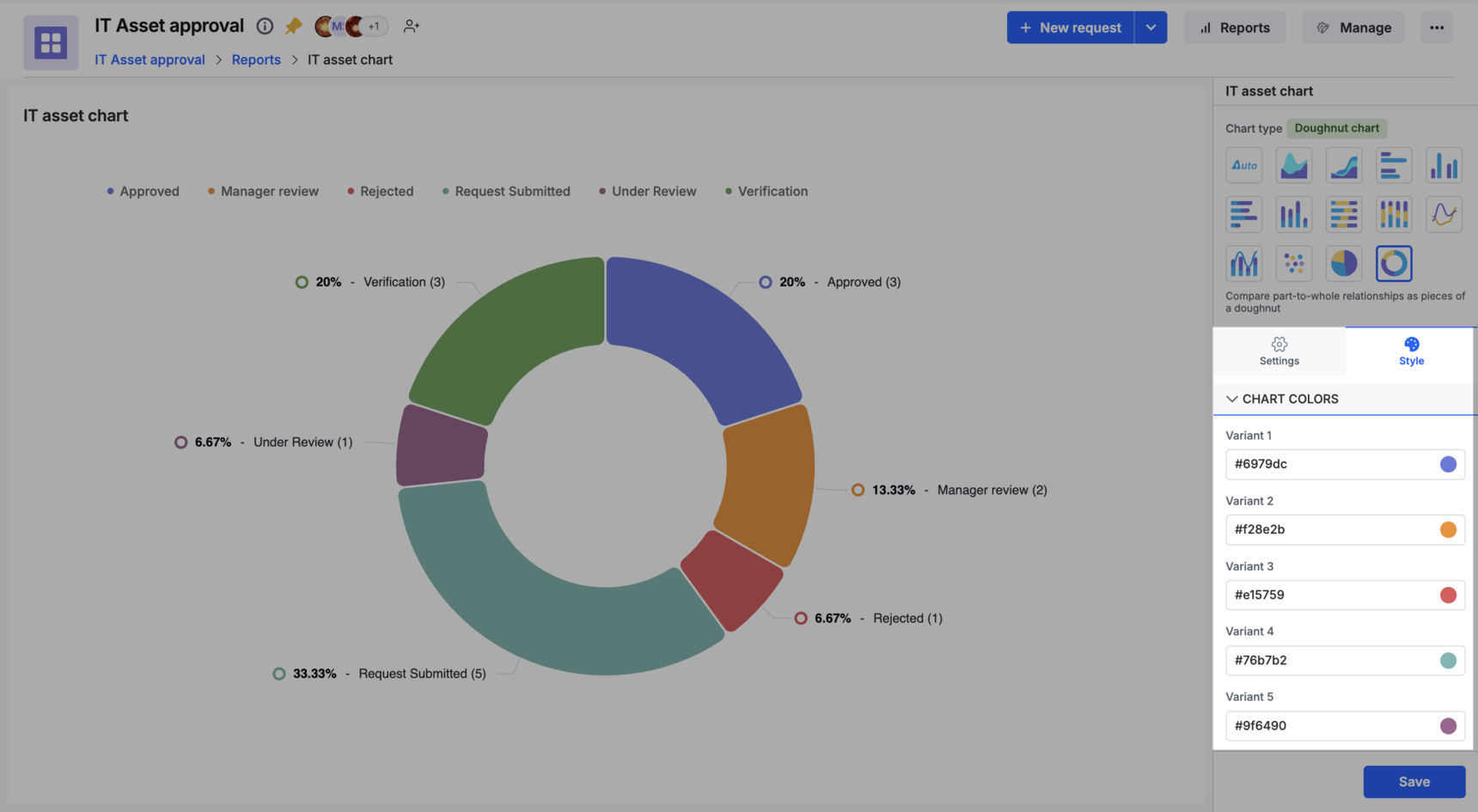
- Doughnut charts are meant to express a part-to-whole relationship, where all pieces together represent 100%.

- Pie charts are similar to doughnut charts, but with the middle area filled in.

- Stacked charts consists of the total divided into parts (present in legend) for each category. It helps to effectively display and compare the proportion of different data series within each category. You can create Stacked horizontal bar chart and Stacked vertical bar chart based on your preference.

- 100% stacked charts chart type shows the percentage of multiple data in stacked columns, where the total of stacked columns always equals 100%. You can create two types of 100% stacked charts: 100% stacked vertical bar chart and 100% Stacked horizontal bar chart.

Configuring a chart
Choosing fields
To configure the report, start by choosing the fields you want to display, on the right panel. There are two types of fields to choose from.
Custom fields - These are fields you created on your board form and are unique to your board.
System fields - These are system-generated fields that are created by default for a board.
- Title
- Created by
- Modified by
- Created at
- Modified at
- Flow name
- ID
- Assignee
- Status
- Priority
- Start date
- Due date
- Requester
- Resolution time
You can choose an unlimited number of fields for your report. You will see a sample set of 10 items in a preview on the left.
Settings
- Dimension is the main field you want to use to compare data. For graphical charts, it will be the x-axis.
- Measure is the other field(s) you want to use to compare data. This is the y-axis in graphical charts. You can display multiple measures in the same chart.
- Legend refers to the area in the chart describing each of the parts of the chart and will be visible only in auto, horizontal, and vertical charts.
Type of scale
There are two types of scale:
- Linear scales are the default scale type and show the scale in equal increments.
- Log (Logarithmic) scales show the increment in multiples of the previous one, such as double, or ten times its size.
Labels
You can choose which labels you want to display on your chart.
- X-axis is horizontal on most charts except for horizontal bar charts, where the X-axis is vertical.
- Y-axis is vertical on charts except for horizontal bar charts, where the Y-axis is horizontal.
- Data labels display the information on the line item or bar. Hover over on the chart to view the label.
- Legends are explanations of the symbols used in the chart. It is located on the top-left of the chart.
Adding filters
To narrow down specific data in your report, you can add filters. Click the Add advanced filter button to add a filter. Choose the fields you want to filter and then enter the conditions.
Click + Add new filter button to add more filters and conditions to the same field. The new condition can be either AND (all conditions must be met) or OR (any one condition must be met).
Enabling drilldown in charts
The drilldown feature enables you to delve deeper into your report data by displaying a tabular view of underlying rows associated with specific data points in charts. Drilldown is enabled by default when creating a report. You can toggle drilldown on or off in the report configuration.
To enable drilldown,
Navigate to the settings tab.
Under Drilldown section, enable drilldown.
Select at least two fields.
Click Apply.
Note:
The report’s selected fields are automatically chosen as default drilldown fields. Ensure a minimum of two fields are selected for drilldown.
After configuring your chart, hover over it and click to drill down into the data.
Upon clicking the chart, a tabular preview will appear, showing the underlying data. You can search fields, show/hide columns, and export data at runtime. Click the dropdown on each column header to sort your data in ascending or descending order
Applying styles to charts
Under the Style tab, you can choose from 10 different colors to apply to your charts.

