
Dropdown, Multi-select dropdown, Checkbox, Checklists, and Radio buttons
Dropdown field
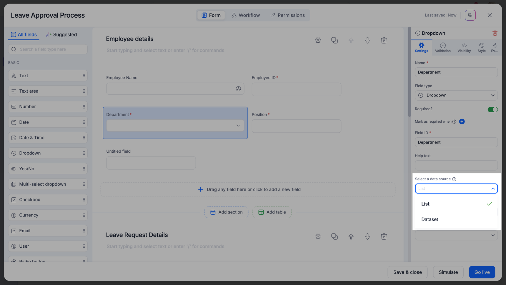
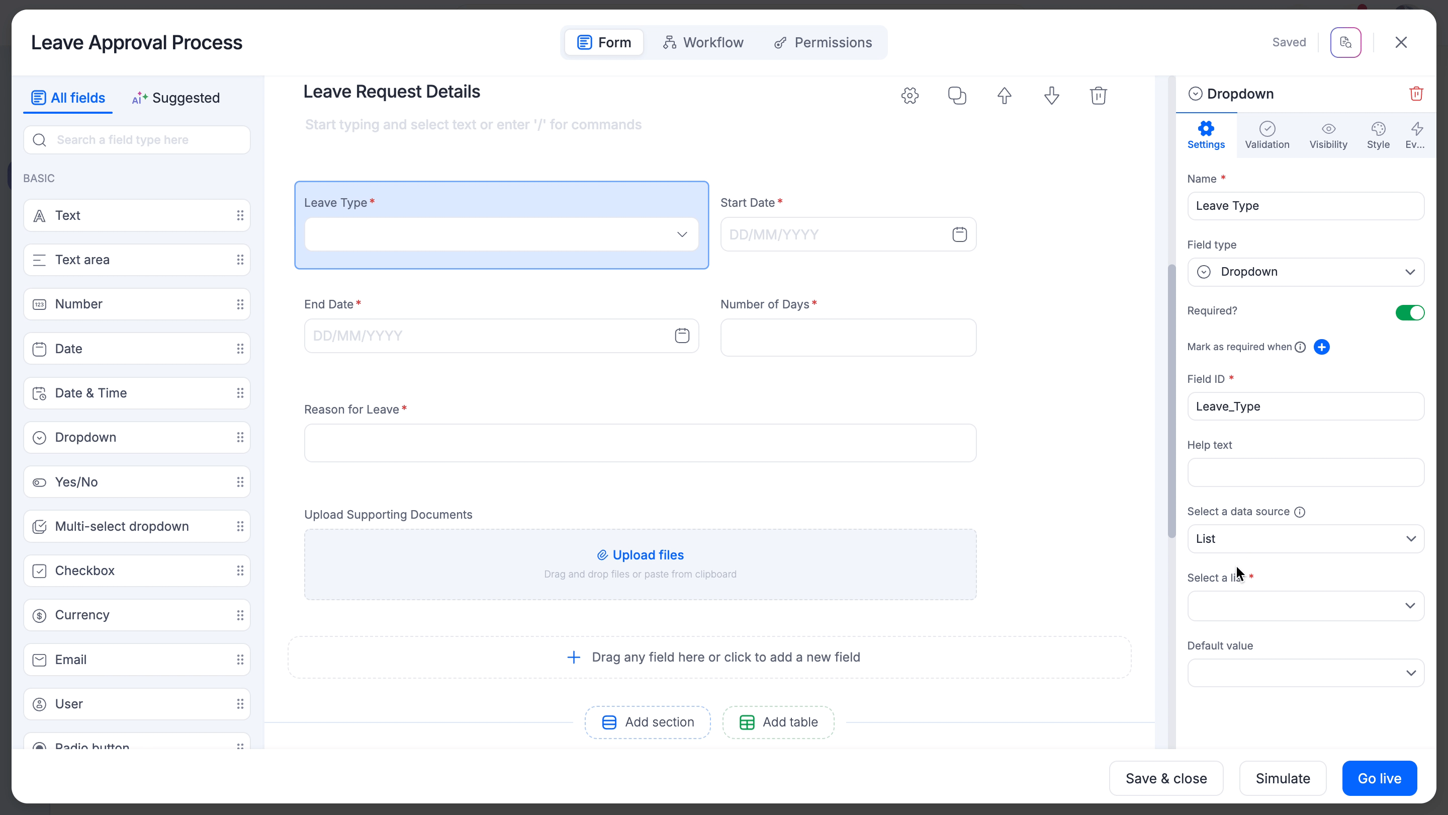
The dropdown field allows users to select one option from a set of values in the form, sourced either from a list or a dataset field.
Dropdown configuration
You can load the dropdown from a static list or a dataset field based on your needs. Choose a List or a Dataset as your preferred data source under the Select a data source field. If you are unsure which data source will suit your requirements the best, refer to this document to learn more.
Note:
In the case of an App's process, board, or dataforms, field values for a dropdown, multi-select dropdown, checkbox, and radiobuttons are sourced from either a dataform or a list.
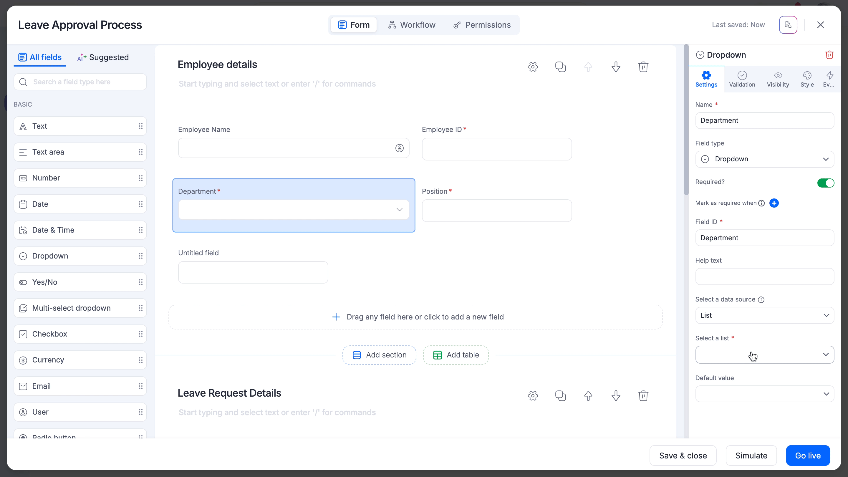
Sourcing data from a list
Under Select a data source, select List to load data from a list. You can select an existing list or click Create a list to add a new list from scratch. When you create a new list, enter the name of the new list in the text field that appears below the search bar and key in its values in the List of items section that appears on your right side.
Note:
When you modify the values of an existing list, the changes will reflect in all the corresponding flows that refer to the list you modify.
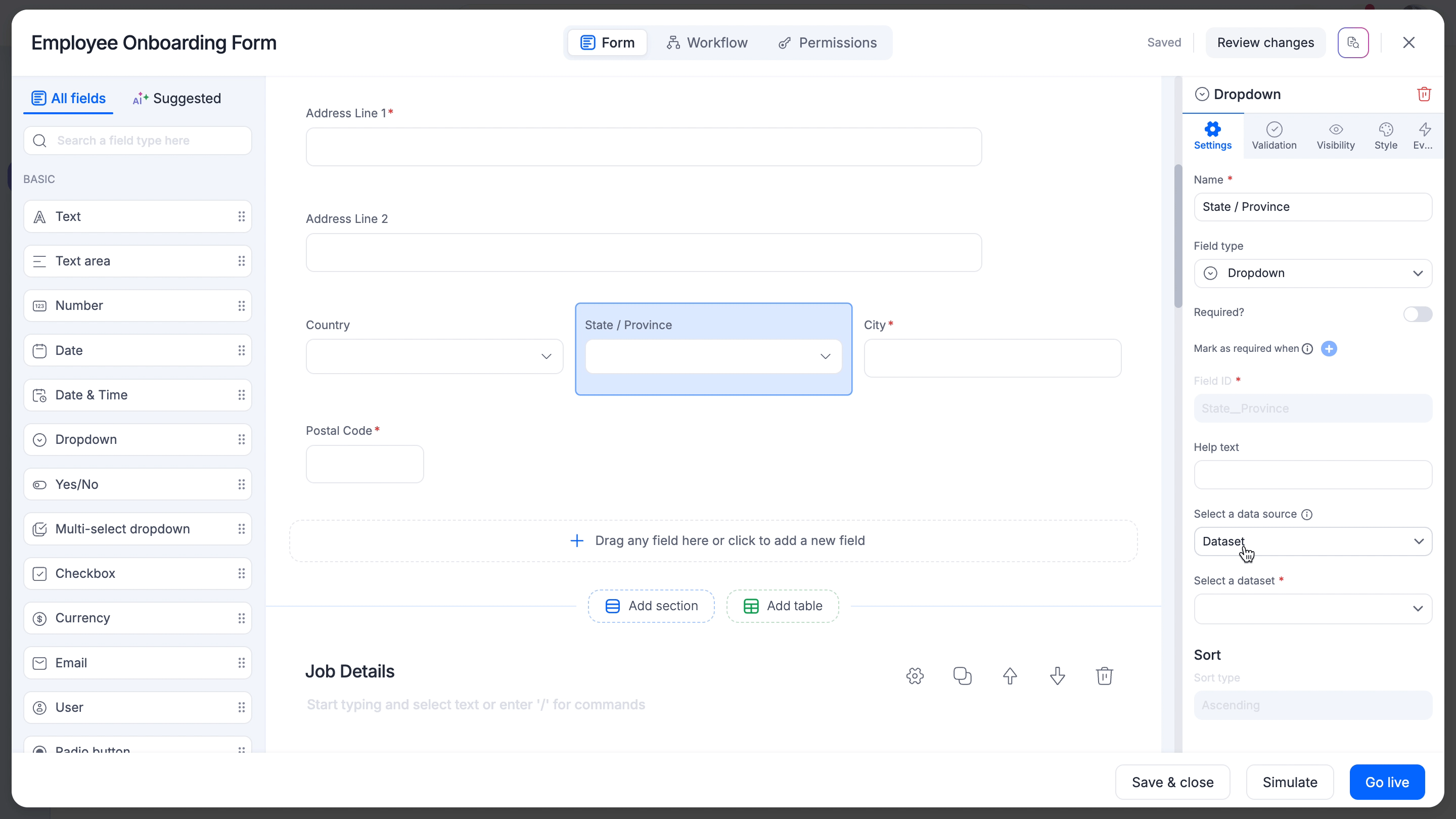
Sourcing data from a dataset
Choosing a dataset field as your dropdown's source has a few significant advantages over a list. When you can display only a static set of values using a list, you can achieve both static and dynamic display of values if the source is a dataset field. You can create dependent dropdowns with dynamically changing values based on other dropdown values or field conditions when the source is a dataset field. However, you can also configure the dropdown to behave as a simple list if you want to.
Populating dropdown with values from a single dataset field
- Under Select a data source, select Dataset to load data from a dataset field.
- Search for your preferred dataset under the Available datasets section on the next page. If the dataset is available, click it once to see the list of available fields. Otherwise, you can create a new dataset from scratch by clicking +Create a dataset and use it to configure the dropdown right away. Click Edit dataset to modify the values of the chosen dataset as necessary.
Tip:
Please note that you must have at least one field in your dataset with values in order to configure the dropdown, multi-select, checkbox, or radiobutton field immediately. However, you can go back to the specific dataset and populate values anytime you want and resume the configuration later.
- Next, click the preferred dataset field from the Choose a dataset field panel to view the list of unique values in the field. You will only see the unique values of the dataset field under Dataset field values, and only the first 50 values are usually listed for previewing purposes. You can, however, access the entire dataset with its original values separately.
- Click Select when you are done.
Note:
You can add filter conditions against a specific static value or another dropdown value and make the dropdown dynamically change values based on the user's selection in the live form.
Validations
There are two types of validations you can use with a dropdown field:
- Equal to
- Not equal to
Adding filter conditions in your dropdown field
After configuring the data source of your dropdown, you can add filter conditions and limit the data displayed in the dropdown.
Click the Add filter to populate the dropdown based on specific conditions. You can filter the dataset values against a constant value, a single dataset field (without filter conditions), or multiple dataset fields linked by filter conditions as necessary.
Filtering values based on a constant value
To filter the dataset field values based on a specific value, set the filter condition as follows:
Filter condition format |
Example condition |
[<Select field name>] [Equal to] [Value] [Enter value] |
Country :: Equal to :: US |
This condition will display only the states in the US in the live form.
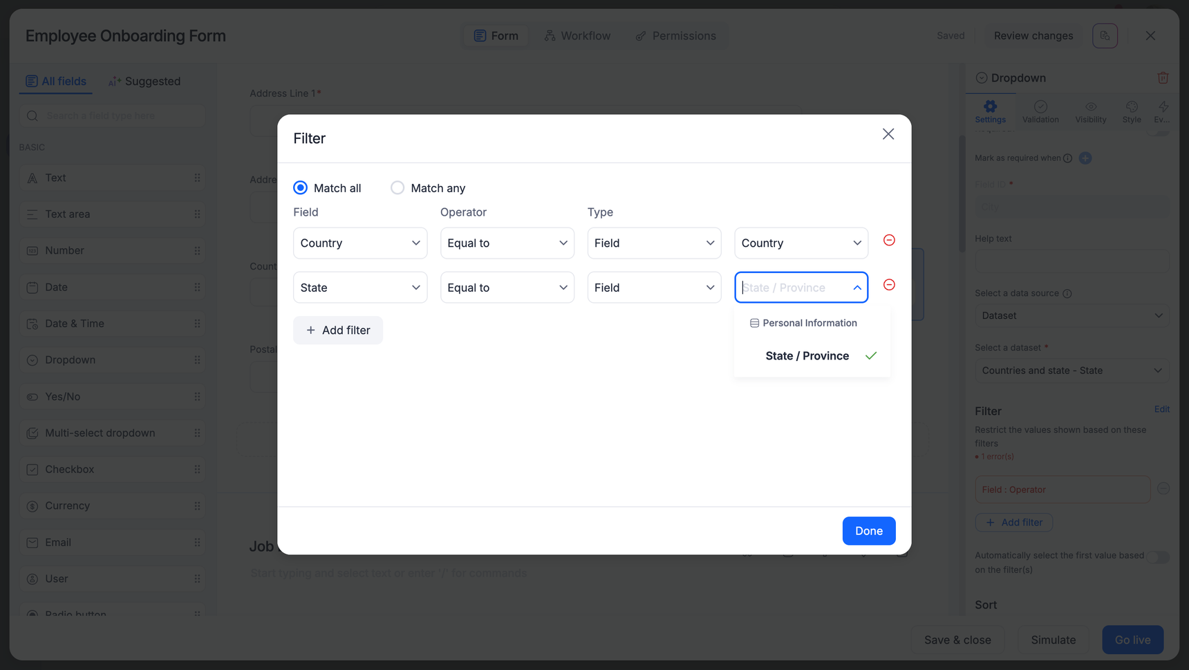
Creating a dependent dropdown
To filter the dataset field values based on any value chosen in another dropdown, set filter conditions by choosing the field name instead of keying a specific value. You can also add as many conditions as you want until you achieve the desired results.
[<Select field name>] [Equal to] [Field] [Select field name]
- Create a dropdown State to display states based on the country chosen from the Country dropdown. 'State' is the first dependent dropdown.
- Under Select a data source, select Dataset.
- Search for the Countries and state dataset and select the State field. The following screen recording is an example of how the State dropdown will list the states belonging to the country the user chose in the form.
- Create another dropdown City to list all the cities based on the country and state chosen by the user.
- Select the same dataset, as its source and choose the City field. Add the following filter conditions to configure the City dropdown to dynamically change values based on the values chosen in the Country and State dropdown fields.
Tip:
You can create dependent dropdowns using datasets and filters only. When you use an App, dependent dropdowns can only be created using dataforms. The List mode helps you to load data only from a static list so make sure to choose a dataset/dataform as the data source for your dropdown whenever you have certain field validations that will impact the dropdown values in your requirement.
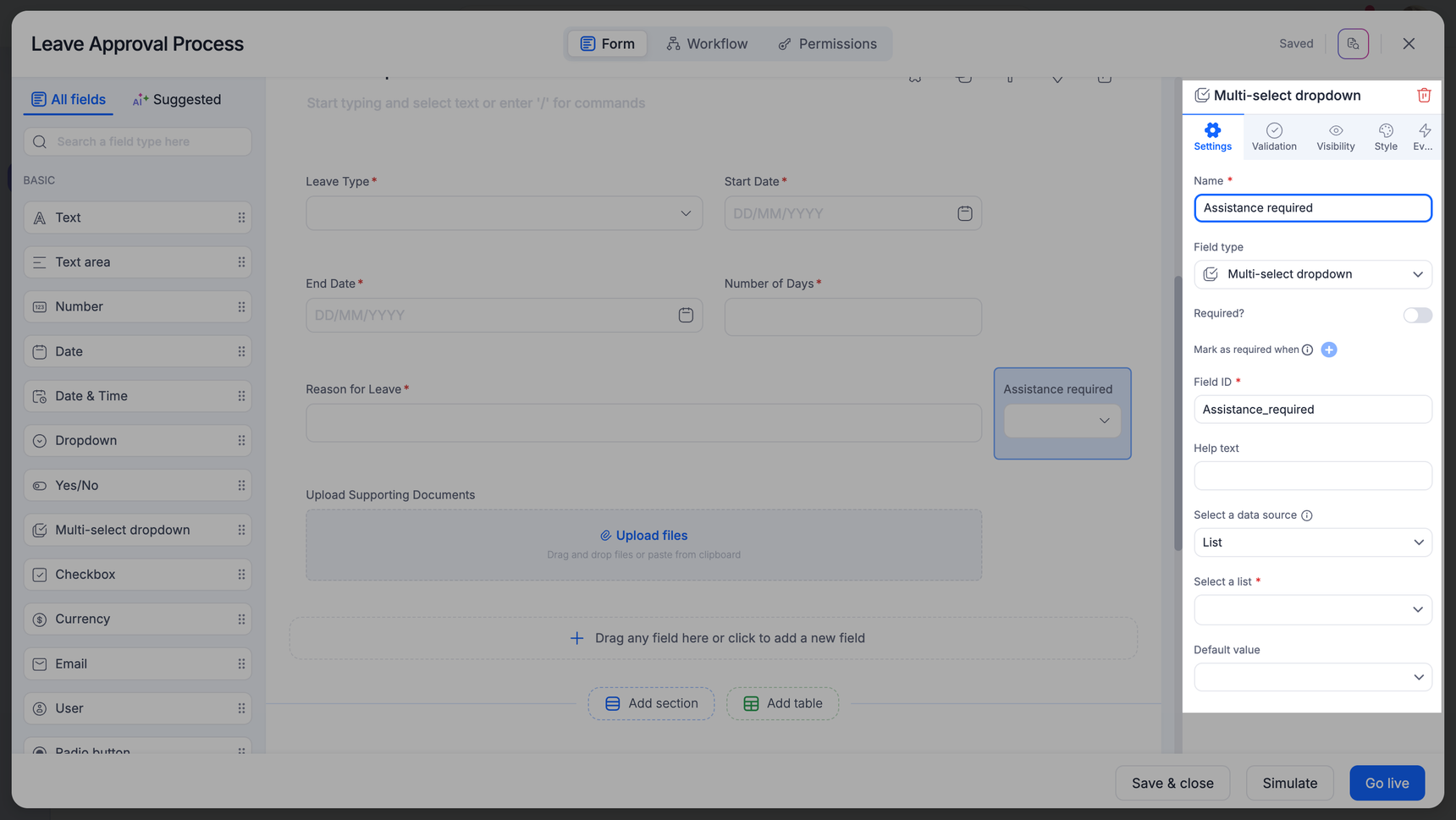
Multi-select dropdown
The Multi-select dropdown field allows users to select multiple options from a dropdown in the form.
Settings
Under Select a data source, choose an existing dataset or list. If you don’t have any, create a list or dataset from scratch. In the case of Apps, you can choose a dataform or a list as the primary data source.
Note:
When you modify the values of an existing dataset or list, the changes will be reflected in all the flows that refer to it.
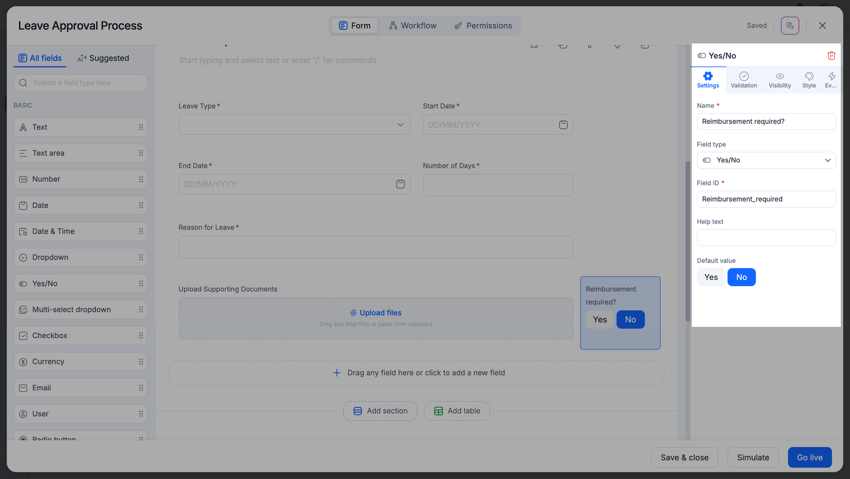
Checkbox field
The Checkbox allows users to check more than one option from a list of options in the form.
Settings
Under Select a data source, choose an existing dataset or list, or click one from scratch. In the case of Apps, you can choose a dataform or a list as the primary data source.
Note:
You can only access the first 250 records from the dataset or dataform in their sorted order.
Validations
There are four types of validations you can use with a dropdown field:
- Minimum number of selections
- Maximum number of selections
- Selection should contain (one value that must be present)
- Selection should not contain (one value that must not be present)
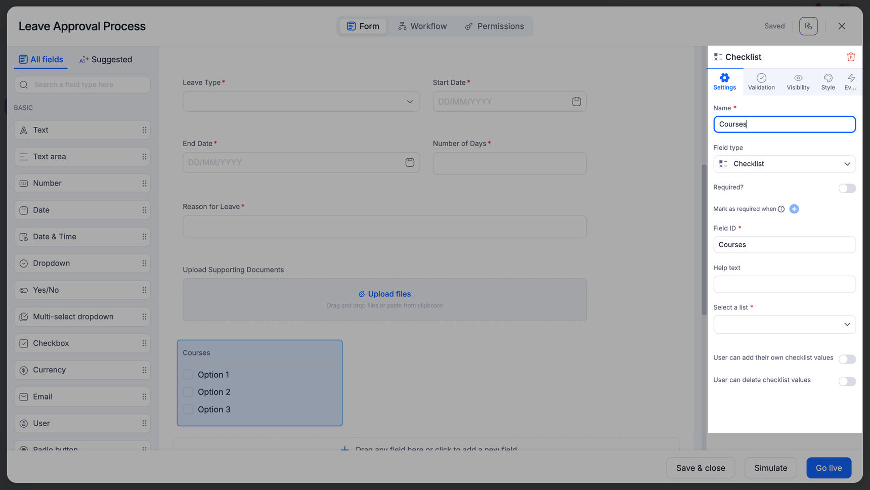
Checklist field
The Checklist allows users to check off several options from the list.
Settings
Under Select a list, choose an existing list or click Create a list to add a new list from scratch. When you create a new list, enter the name of the new list in the text field that appears below the search bar and key in its values in the List of items section that appears on your right side.
Enable the Users can add their own checklist values option to let the form users add values of their choice to the list on their forms. However, the values added by them will not be added to the primary list. Similarly, you can enable the Users can delete checklist values option to let them delete a few checklist values as necessary.
Validations
There are three types of validations you can use with a dropdown field:
- Minimum number of selections
- Maximum number of selections
- Select all (the user must check off all the values)
Expressions for list fields
You can’t use an expression to create a value in a list, but you can use the values in other expressions.
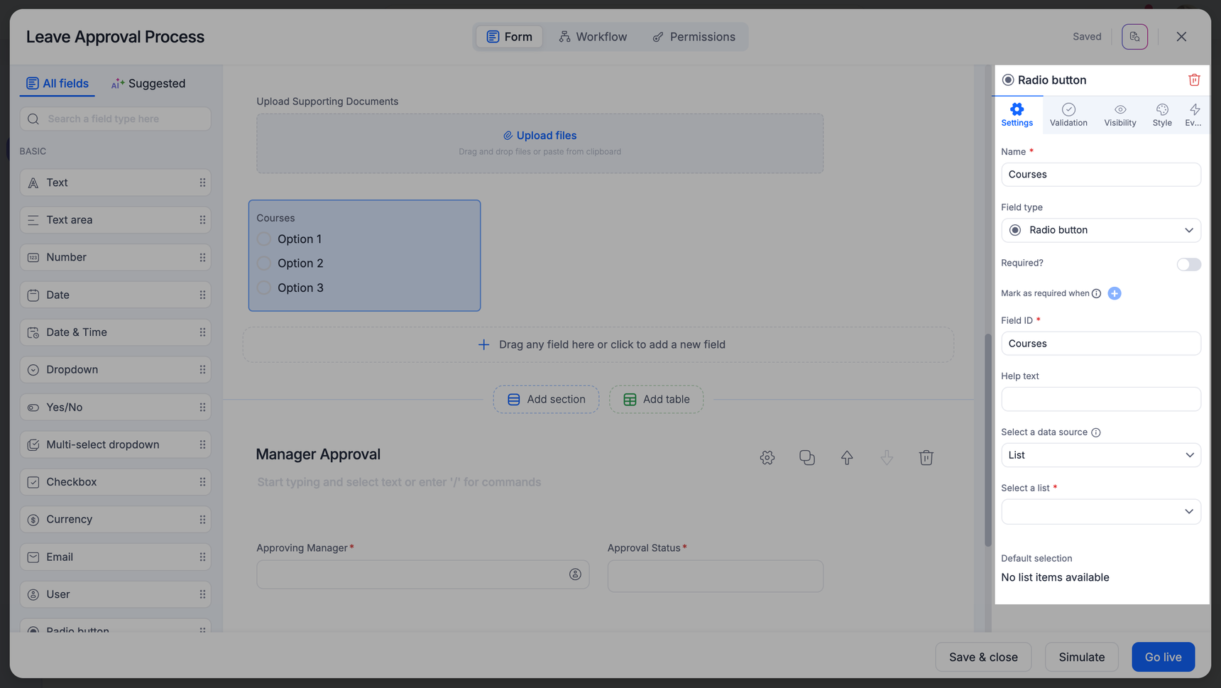
Radio button
The radio button field allows users to select only one option from multiple choices. Like dropdown, multi-select dropdown, and checkboxes, you can source the values for this field from a list or a dataset. The radio button field values are shown as clickable options on the form. In contrast, the options in the dropdown field are only visible after the user clicks the field.
Settings
Under Select a data source, you can choose an existing dataset or list. If you have nothing to choose from, you can create a list or dataset from scratch. In the case of Apps, you can choose a dataform or a list as the primary data source.
You can set a default value for the radio button field by selecting a suitable option under Default selection. You can also unselect the default selection using the Reset option.
Note:
You can only access the first 250 records from the dataset or dataform in their sorted order.
Validations
You can use two types of validations with a Radio button field. They are:
- Equal to
- Not equal to
Note:
Once a user makes a selection in the Radio button (
) field, they will not be able to return to the initial state where no option was chosen.
FAQs
1. How many records are displayed when using a dataset or dataform as a data source for checkbox and radio button fields?
The first 250 records alone will be displayed based on the sort order of the dataset or dataform.
2. Which field types support dependent field behavior?
Dependent field behavior capability is available for Dropdown and Radio button fields.
3. Do Multi-select and Checkbox fields support dependency dropdowns?
No, dependency dropdown capability does not apply to Multi-select dropdown and Checkbox fields.
4. What are the possible data sources for field options?
The options in the Dropdown, Radio, Checkbox, and Multi-select fields can be sourced from a list or a dataset. In the case of Apps, the data sources are lists and dataforms.
5. Is there a limit to the number of options when using a list as the source?
Yes, by default, lists can have a maximum of 250 values.
6. How many options are displayed when using a dataset or a dataform as the source?
This depends on the field type:
For Dropdown fields and Multi-select dropdown: The entire set of values from the dataset or dataform can be displayed.
For Checkboxes and Radio fields: Only the first 250 values from the dataset or dataform will be displayed.
7. Are the dataset or dataform values sorted or filtered when displayed?
Yes, the 250 values displayed for Checkboxes and Radio fields are based on any sort and filter conditions applied to the dataset or dataform.
8. What are the common issues with dropdown fields and how do I fix them?
- Dropdown field may not display some or all of the options
- There may be error messages due to validation errors or invalid selections
Admins can edit a form and verify if the list or dataset or dataforms selected as the datasource are valid and have enough data to display the choices.
- Ensure dropdown options are correctly mapped to the source.
- Review any validations or visibility conditions set on dropdown fields.
Dropdown issues usually arise from incorrect configurations and data availability. Verifying the above will help in resolving dropdown issues. If they still persist, consider reaching out to Kissflow support for additional troubleshooting assistance.