
Creating custom components using AI
Custom page components let you build fully tailored UI experiences using AI. Describe exactly what you need to the AI chatbot and it generates a ready-to-use page component for your app.
Building a custom component using AI
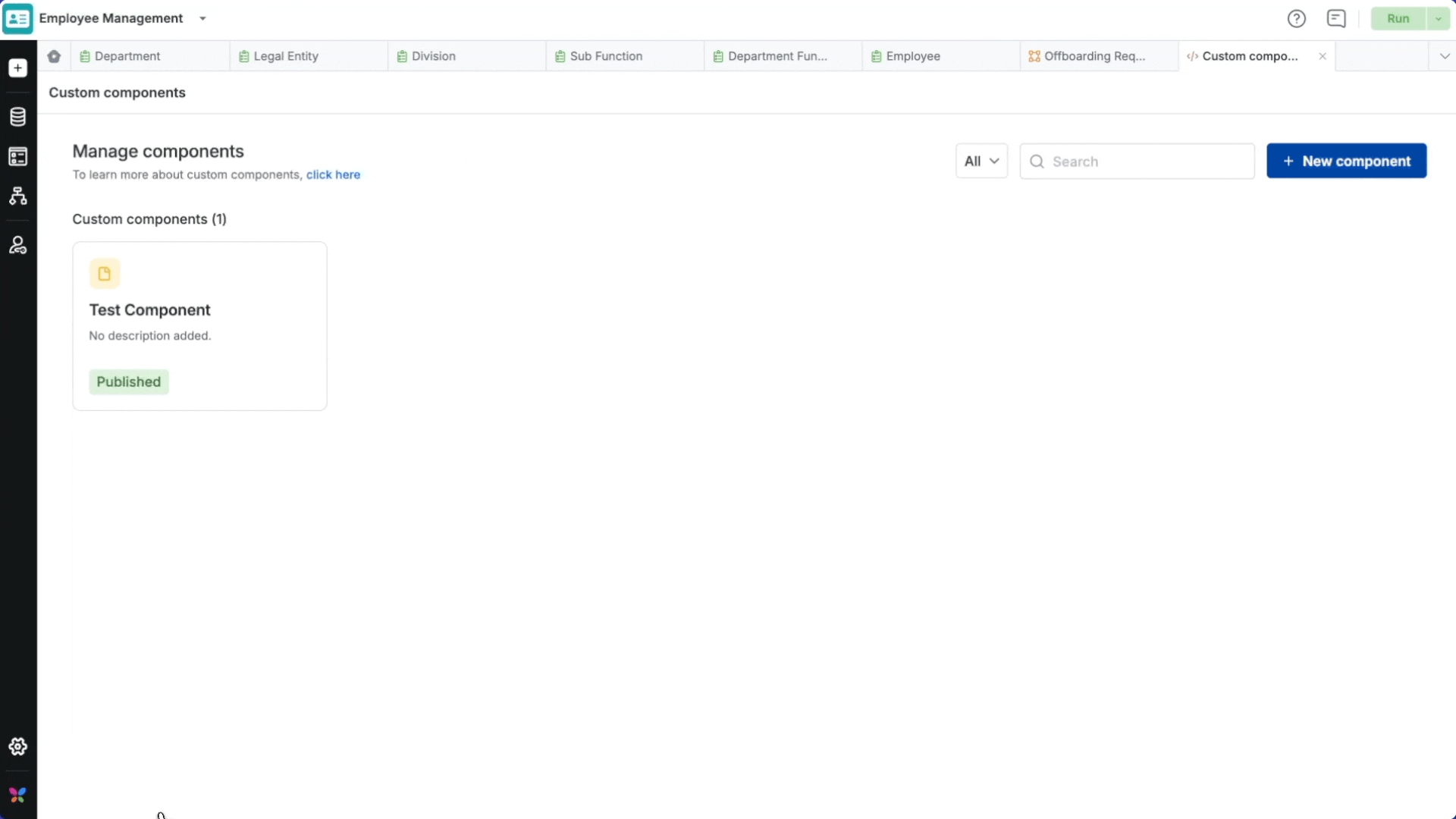
- Open App Builder. In the left nav, go to Interface → Components.
- Click New Component.
- You will find two options: Create and upload & Build with AI. Click Build with AI.
- Choose Page as the component type and enter a name.
- Enter detailed instructions describing what you want the AI to build.
- Click Create. The AI will generate the component and display a live preview in the center panel.
Tip: You can continue refining the component at any time by typing further instructions into the AI chatbot.
Writing effective instructions
The more detail you provide about the look and feel of your component, the better the result. Your instructions should cover:
- Data source: Reference a form by its full name or ID (e.g.,
Hiring requests formorHiring_requests_A00). Type/to browse and attach forms directly. - Features: Search, filters, sorting, collapsible panels, etc.
- Layout: Cards, tables, lists, and how items should be arranged.
- Visual style: Color coding, spacing, card size, and other design preferences.
Example:
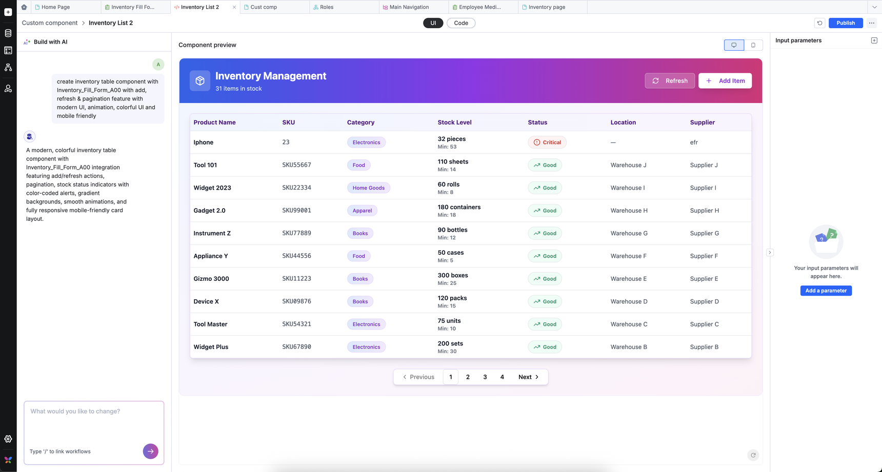
Create an inventory table component with Inventory_Fill_Form_A00 form. The table should have add item, refresh & pagination features with modern, colorful UI, smooth animations, and keep it mobile friendly.
Previewing the custom component
- Once you click Create, the AI begins building your component immediately. A live preview appears in the center panel as soon as generation is complete.
- To refine the component, type your changes as detailed instructions in the chatbot. The AI will update the component accordingly.
- You can also inspect the underlying code by clicking the Code tab in the preview panel. The editor is read-only, so any modifications must be made through the chatbot rather than directly in the code.
Note: This feature offers built-in Kissflow SDK integration. This means, AI automatically incorporates Kissflow's SDK methods into the generated component, so your component can interact with the other native components on the page seamlessly.
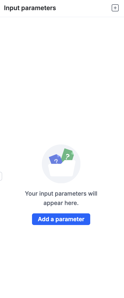
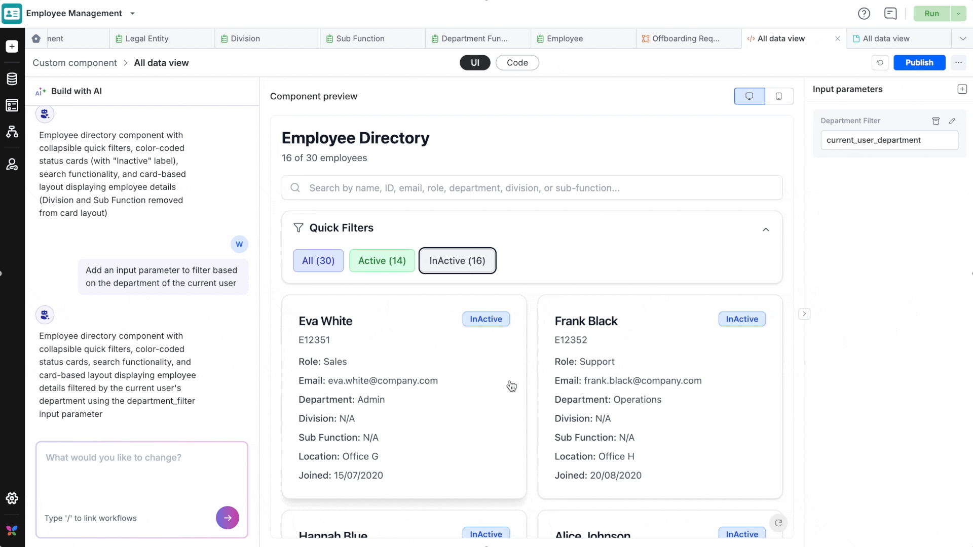
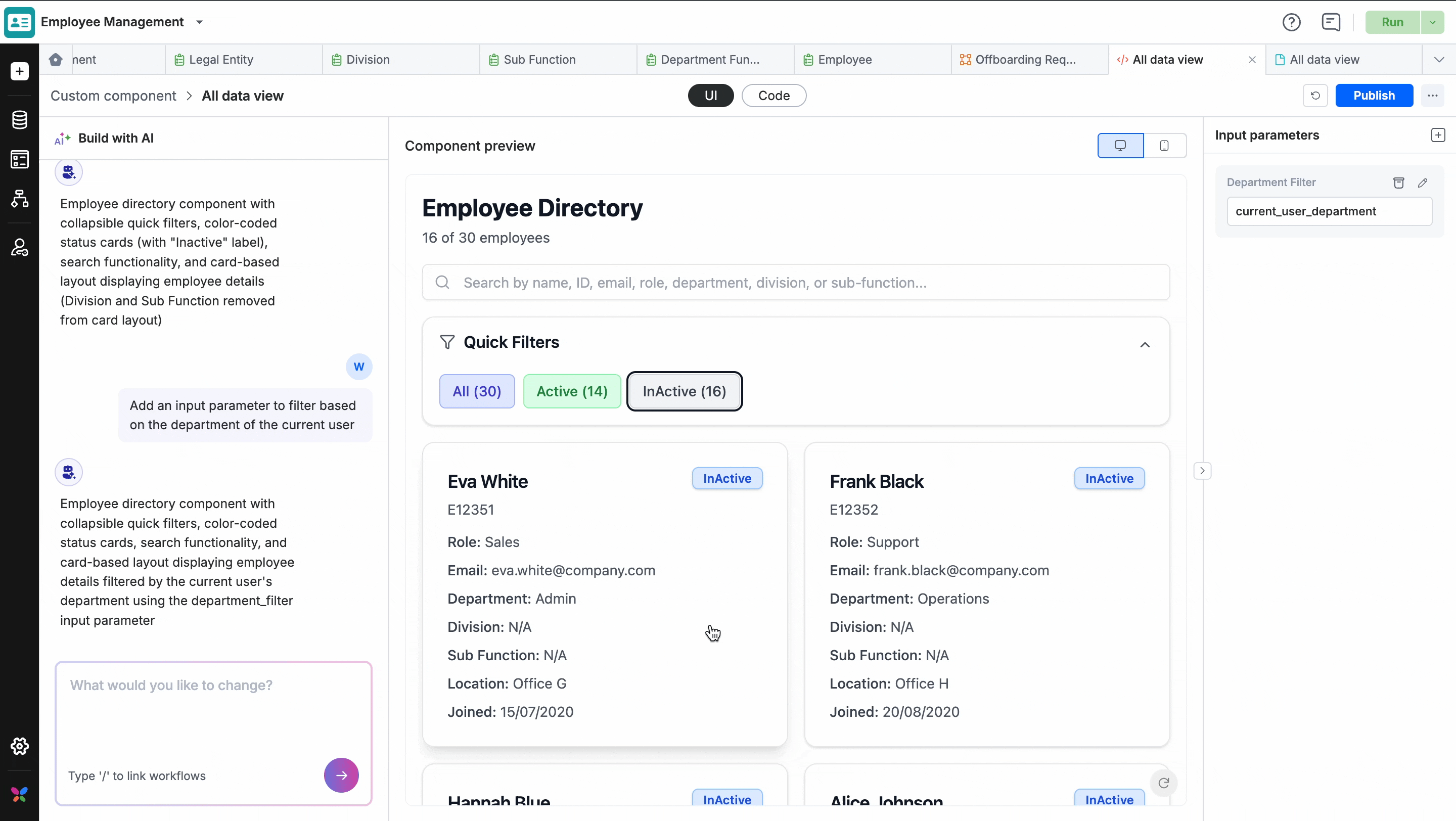
Creating input parameters
You can create input parameters either by asking the chatbot or manually via the right-side panel.
To add one manually:
- Click Add a Parameter.
- Fill in the parameter name, ID, type, and default value.
Supported parameter types: String, Number, Static drop-down.
Important: If you update an existing parameter (e.g., changing its type or default value), you must explicitly instruct the chatbot to apply those changes to the component. Updates to parameters do not take effect automatically.
Publishing
Click Publish in the top bar to bundle and deploy your component to the app. Once published, the component is available to use on any app page.
Note: Publishing acts as a save operation. Always publish before reverting if you want to keep your changes.
Reverting changes
Click Revert to roll the component back to its last published version. This is useful for discarding unwanted edits in one step.
Note: Revert operation cannot be undone. Any unpublished changes will be permanently lost.
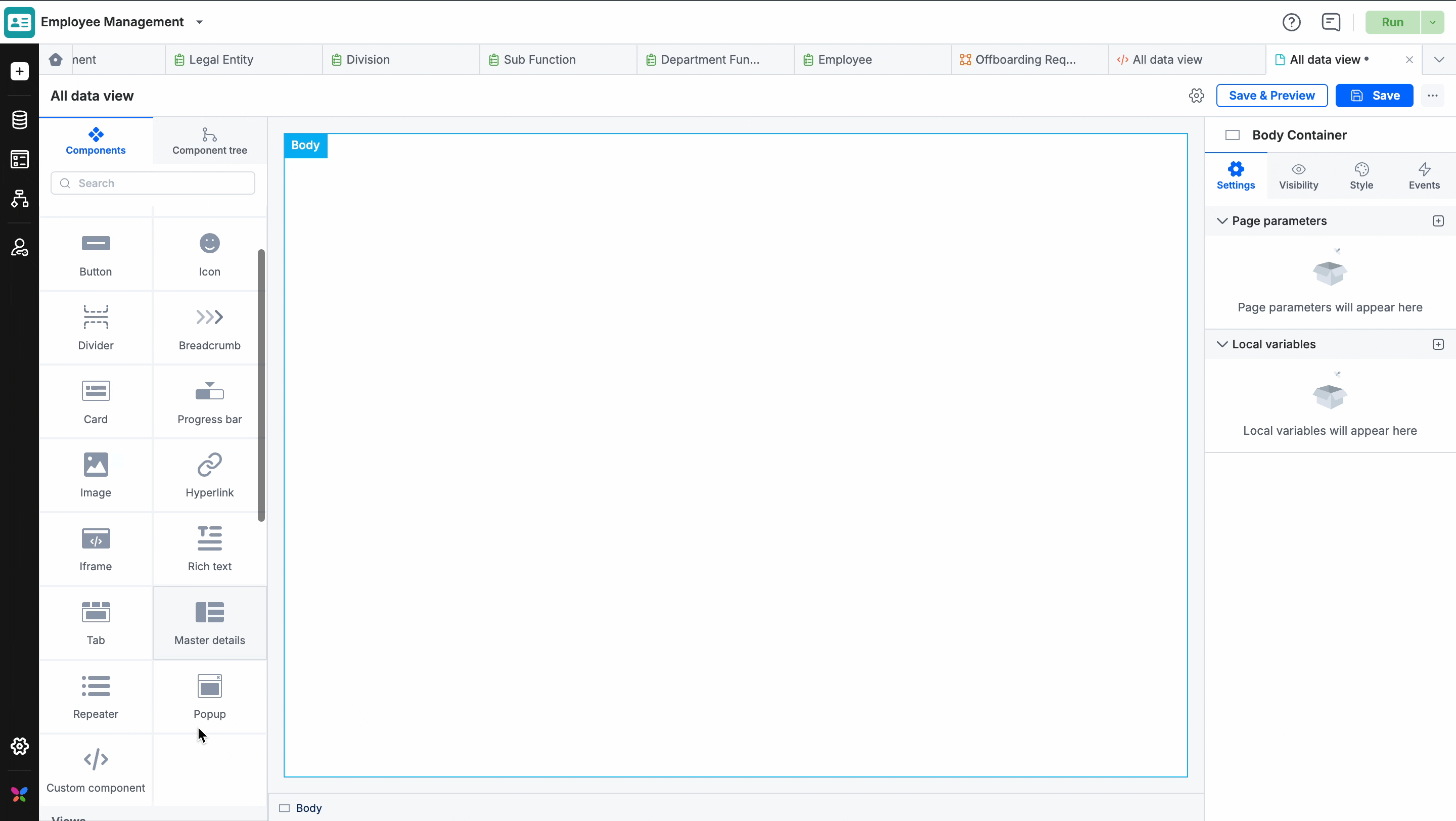
Using a custom component on a page
- Open the page in the page builder.
- Drag and drop the Custom component widget onto the page.
- Select your component from the Select custom component dropdown.
- Save and preview the page.
Note: Custom components can be used alongside system components on the same page. However, page builder configuration settings apply only to system components, not custom ones.
FAQs
- How many custom components can I create per app?
You can create up to 10 AI-generated components per app, including drafts.
- What happens if I hit the daily chatbot limit?
Each user can make up to 50 exchanges per day with the chatbot. Once reached, editing is locked for 24 hours — after which you can continue as normal.
- Can other users see my chatbot conversation history?
No. Only the component's creator can view their chatbot exchange history. All other users can still preview, edit, and publish the component as needed.