
Repeater
What is the repeater?
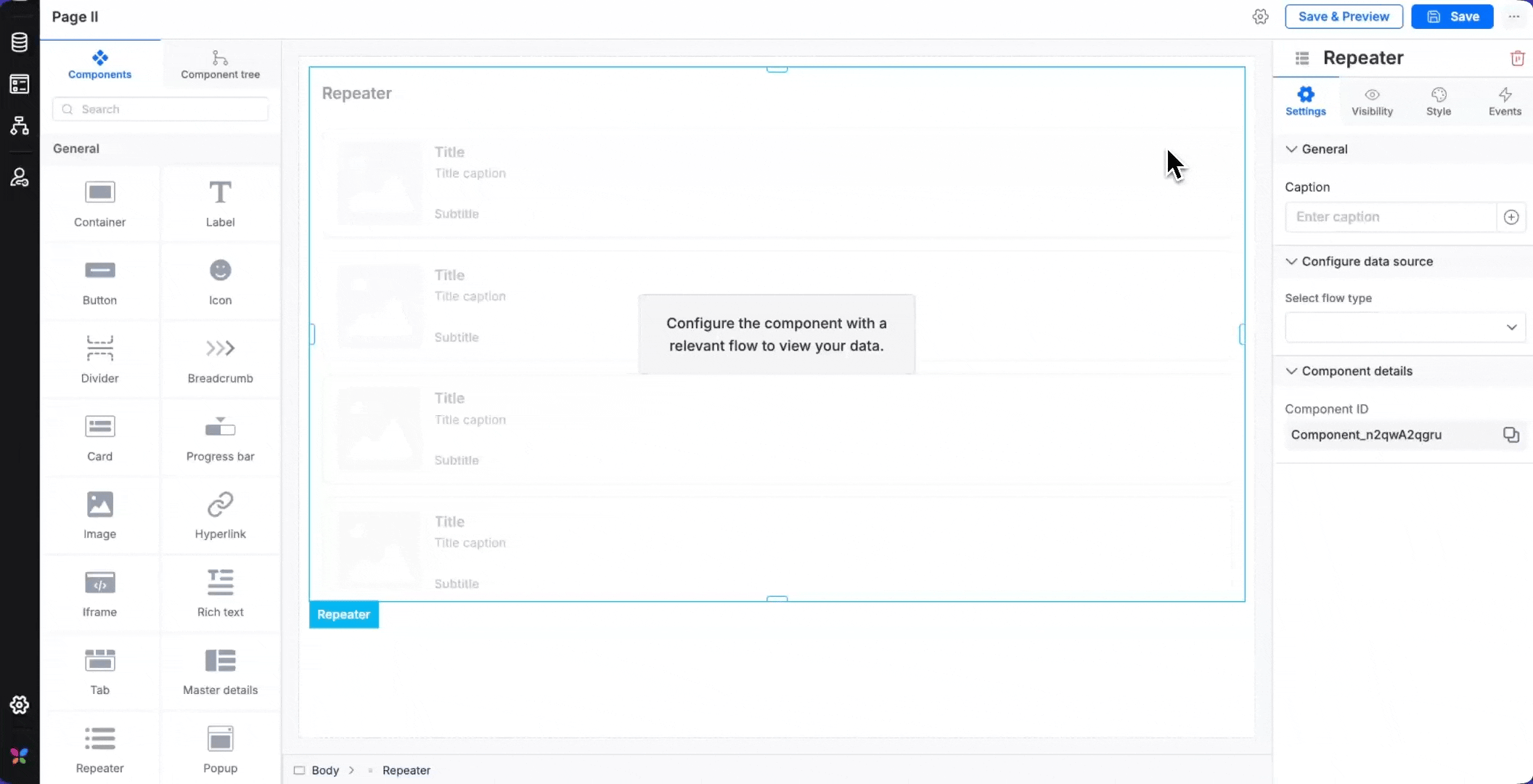
The Repeater is a powerful, configurable data display component that lets you design a layout template once and automatically repeat it for every record in your dataset. Connect it to any data source — forms, processes, or boards — and it renders each item using the same template, keeping your UI consistent without manual effort.
Key features
- Virtualized rendering: handles large datasets without performance impact
- Infinite scroll: automatically loads more records as users scroll
- Drag-and-drop integration: seamlessly works with the page builder interface
- Template-based design: create once, applies to all data records
- Performance optimization: maintains smooth scrolling regardless of dataset size
Use case
The Repeater offers exceptional flexibility for displaying dynamic datasets while maintaining consistent design patterns. Virtualized rendering ensures optimal performance regardless of data volume, and the event properties ensure rich interactivity. These capabilities make the component ideal for dashboards, data management interfaces, and workflow applications where you need to present structured information efficiently.
Example
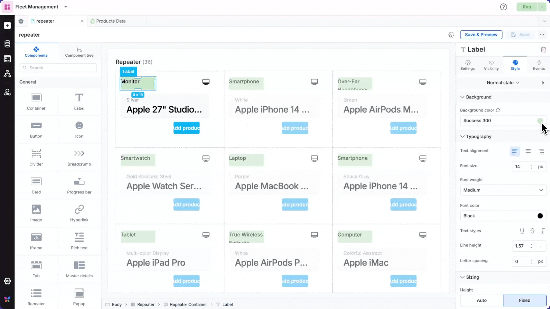
In an e-commerce product catalog, a repeater can be used to display product inventory. Each product is designed as a card containing category icons, product names with color variants, and Add product action buttons.
Using the on click event, you can set up clicking on an Add product button to redirect to add a new form item or checkout flow, while the on mount event could automatically filter products based on the user's preferences or location.
The repeater's grid layout with 3 columns provides an organized catalog view on desktop, while automatically adjusting to a single-column list on mobile devices for optimal browsing experience.
Using the repeater component
Drag and drop the repeater anywhere on the page. You could use it as a standalone component or place it within a container.
The repeater itself is essentially a container. You can add a number of components within the repeater. Here's a list of components that can be used within a repeater:
Container, Label, Button, Icon, Divider, Card, Progress bar, Image, Hyperlink, Iframe, Rich text, Card report, Custom component.
Configuring the data sources
The repeater component needs a data source from which it will derive data and allow you to display items based on the item count (in case of a data form/process form/board form).
Repeater pulls data from four sources:
Data forms — Submission records.
Processes — Workflow items (your tasks, assigned items, etc.)
Boards — Board instances (assigned, archived, created by you, etc.)
Variables — Global and local variables of the array of objects type.
Data source configuration
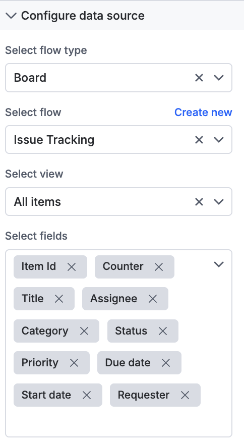
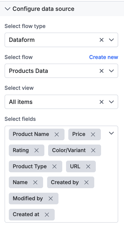
Dataform and Board as data source
When you select a dataform or a board as your data source for the repeater, you must choose a view and all the form fields that apply. The repeater will allow you to use the selected fields as variables to display data on the page.
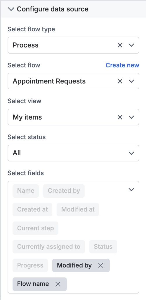
Process as data source
When you select a process as data source, you must choose a step or status, as a process typically has workflow steps. Select the required fields to display.
Variable as data source
You can either choose a local variable or a global variable as a data source. However, ensure that the variable is of the array of objects variable type. Once you select the variable, you can add or remove fields from it.
Regardless of the data source, the fields you select are the ones you will be able to use as variables — you will find them under Data source parameters > Item.
Selecting Data source parameters > Index will provide the index of the item, it can be useful for visibly numbering your items on the repeater.
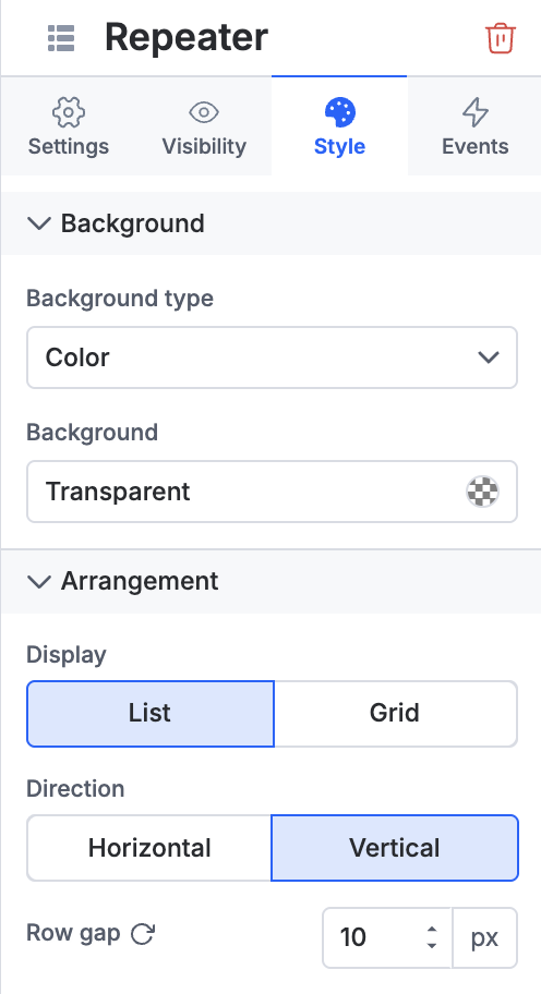
Style properties
You can customize the following for a repeater container:
Arrangement: Change from grid to list layout
Direction: Make it horizontal or vertical
Grid configuration: Choose the number of columns
Spacing: Set column and row gaps as per your preference
All other standard style properties apply here, including options to modify padding and margin, and set border size, color, and radius.
Event properties
The repeater component supports configurable events with the following capabilities:
On click events
Redirection: Enables navigation to a specific page in the app or return to the current page.
Open popup: Opens a popup created using the Popup component, providing quick access to additional context or information.
JavaScript action: Provides the flexibility to define custom actions using JavaScript, allowing you to implement complex interactions and logic specific to your app's requirements
On mount events
For an On mount event, you can set up JavaScript actions that work like an "on load" event — these execute automatically when the repeater component first loads on the page, allowing you to initialize data, set default values, or trigger other setup actions.