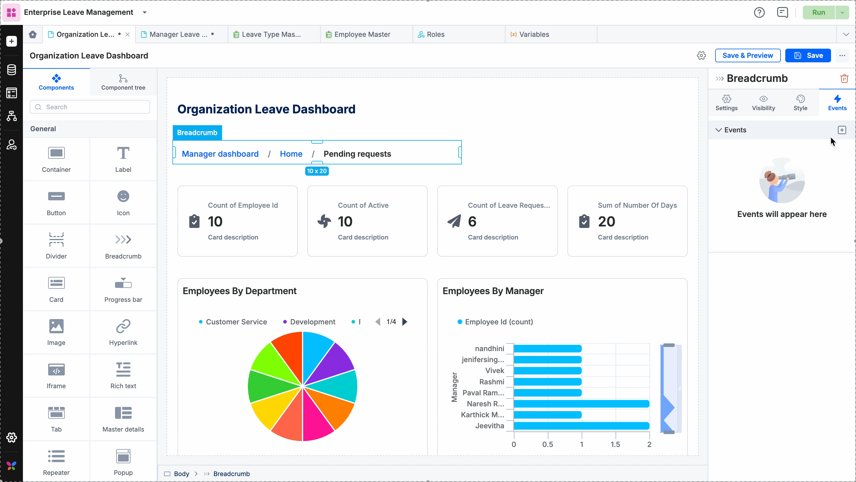
Breadcrumb
The Breadcrumb component provides a secondary navigation trail on any page in your app. It allows users to track their current location within a multi-layered folder or the page hierarchy and navigate to any page with a single click.
What to use it for?
Hierarchical navigation: Simplifies browsing through enterprise structures, such as moving from a Department view to Team-specific pages and individual Employee Profiles.
User orientation: Helps users understand their relative position within a complex application map.
Quick access: Provides immediate links to other pages and enables quick navigation.
How to use it?
Adding a breadcrumb item
Drag and drop the Breadcrumb component onto your page.
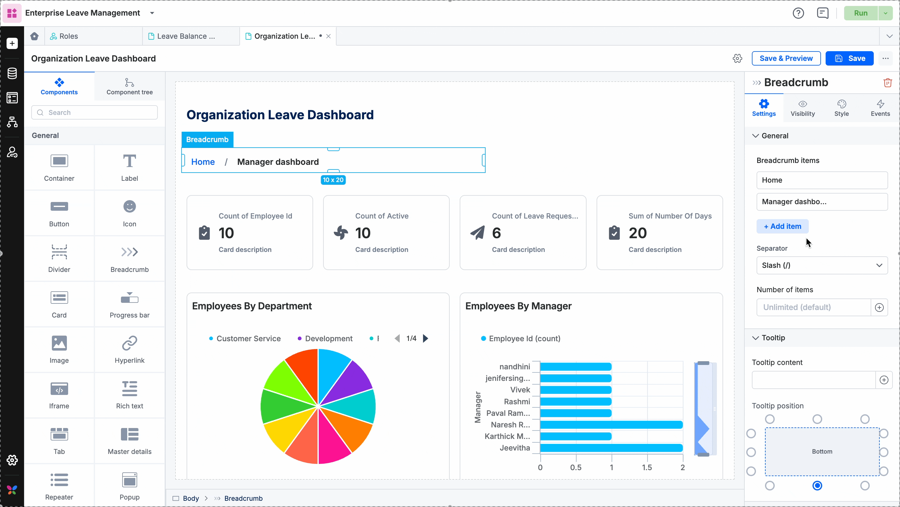
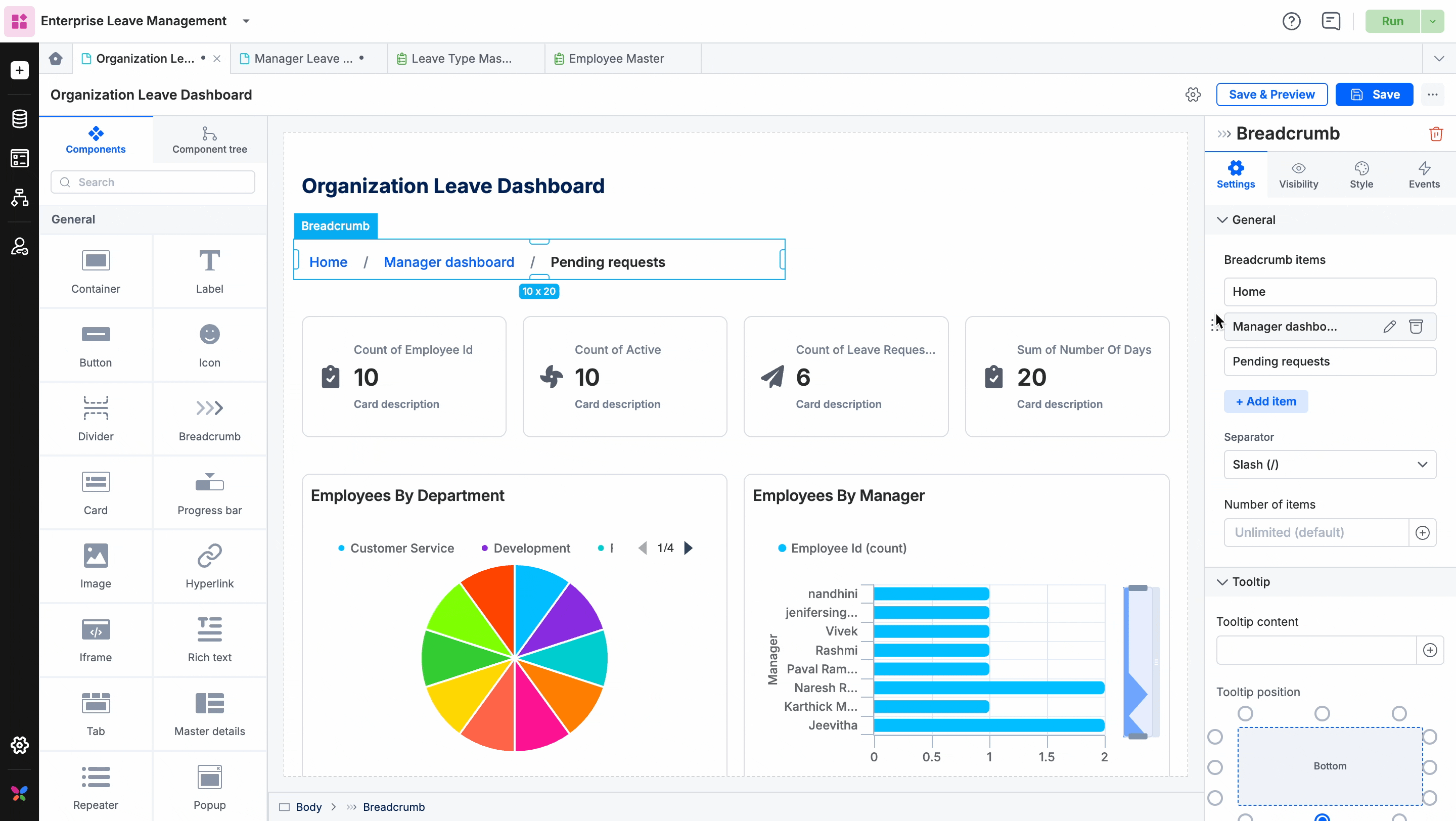
By default, the component includes two items. To add more, go to Settings and click + Add item.
Configuring breadcrumb items
For each item added, configure the following:
Item name: The label that appears on the page.
Redirection page: The destination page when a user clicks the item.
Icon (Optional): Attach an icon to appear next to the item name.
Tip: You can drag and drop items within the Breadcrumb items list in the settings panel to rearrange their order on the page.
Layout and separators
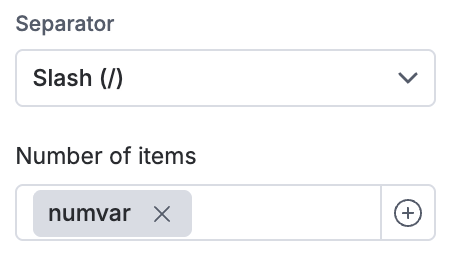
Separators: By default, a Slash (/) is used. You can change this to a Chevron (>), Dash (-), or Dot (.), or upload a custom icon.
Display limits: By default, the component displays an unlimited number of items.
Collapsing items: If you enter a specific number of items to display, you can choose to collapse the breadcrumb trail from the start, middle, or end.
Note: If you use a variable to set this number, the breadcrumb will collapse in the middle by default.
Visibility and style properties
In the Visibility tab, you can set default visibility or create rules to show/hide the component based on specific conditions.
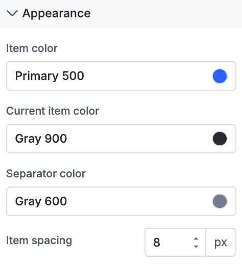
Appearance: Customize the colors for all items, the active (current) item, and the separator. You can also adjust the spacing between items.
General styling: Standard options apply, including sizing, padding, margins, borders, and typography (font size, color, and background). Read component styling properties for more information.
Event properties
To define what happens when an item is clicked, go to the Events tab:
Select the On item click trigger.
Choose one of the following actions:
Redirection: Navigate to a system home page or a specific user-defined page.
Open popup: Trigger a pre-configured Popup component.
JavaScript action: Execute custom logic using JS code.